Prompt: image of a recipe and meal planner concept which for my onboarding screen design. That image should be in hex code #dcdc1e


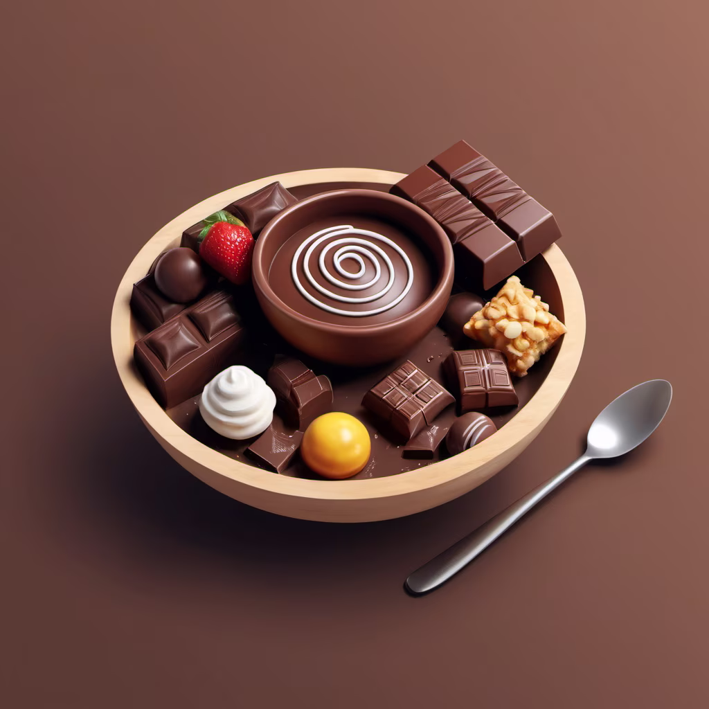
Prompt: Design a UI Of website that Sells Food item, Add 3d element like A bowl full of chocolate etc

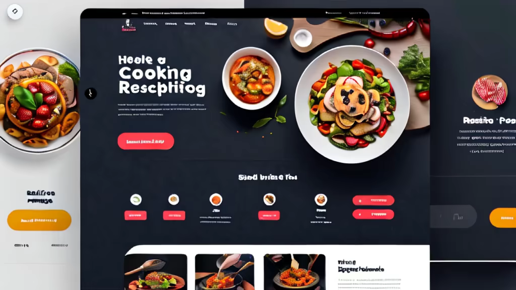
Prompt: Prompt: generate a buatiful 3d animation ui ux landing page design for cooking recipes website in maximum creativity


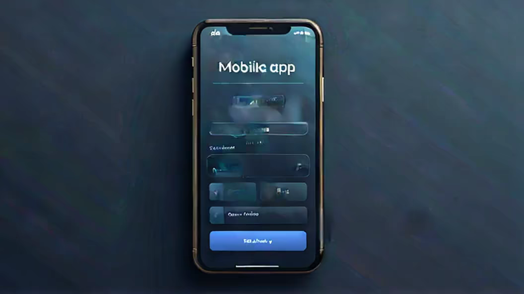
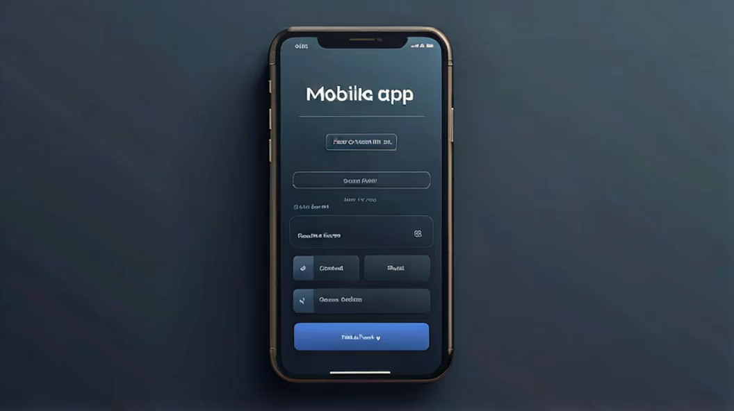
Prompt: Design a main interface for a mobile app for me, with a vertical layout. The bottom of the screen should have a tab bar, or feel free to use your imagination for a unique design.


Prompt: Design a main interface for a mobile app for me, with a vertical layout. The bottom of the screen should have a tab bar, or feel free to use your imagination for a unique design.

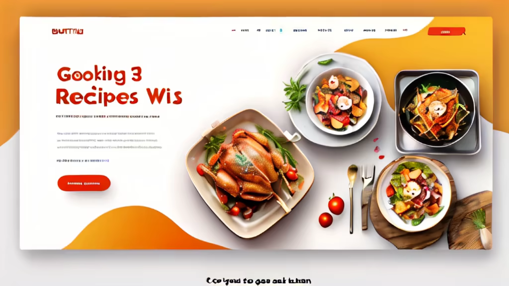
Prompt: generate a buatiful 3d animation ui ux landing page design for cooking recipes website in maximum creativity
Prompt: Generate a user interface design for a portfolio website that embodies a clean and detailed aesthetic. Consider incorporating modern design elements, intuitive navigation, and visually appealing graphics to enhance the overall user experience. Provide a desktop and mobile version to ensure a seamless transition between devices. Focus on showcasing the individual's skills and achievements in a visually compelling manner while maintaining a minimalist and professional look


Prompt: ux/ui page
Negative: ugly, deformed, noisy, blurry, distorted, out of focus, bad anatomy, extra limbs, poorly drawn face, poorly drawn hands, missing fingers


Prompt: A world class modern web app that connects users with local experts who can teach them new skills or hobbies, such as cooking, photography, or yoga.


Prompt: Design me a login screen for the cooking game, with the restaurant visible in the background.


Prompt: Minimalist or flat style UI design for an early education app. Prototype design for UI portfolio.


Prompt: Design a web page interface where users can seamlessly choose between two services - one tailored for professionals and the other for individuals. Create an intuitive layout with clear sections for each category. Utilize a harmonious color scheme, modern typography, and interactive elements to enhance the user experience. Ensure the design is visually appealing and user-friendly


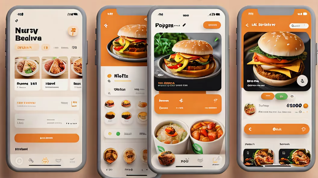
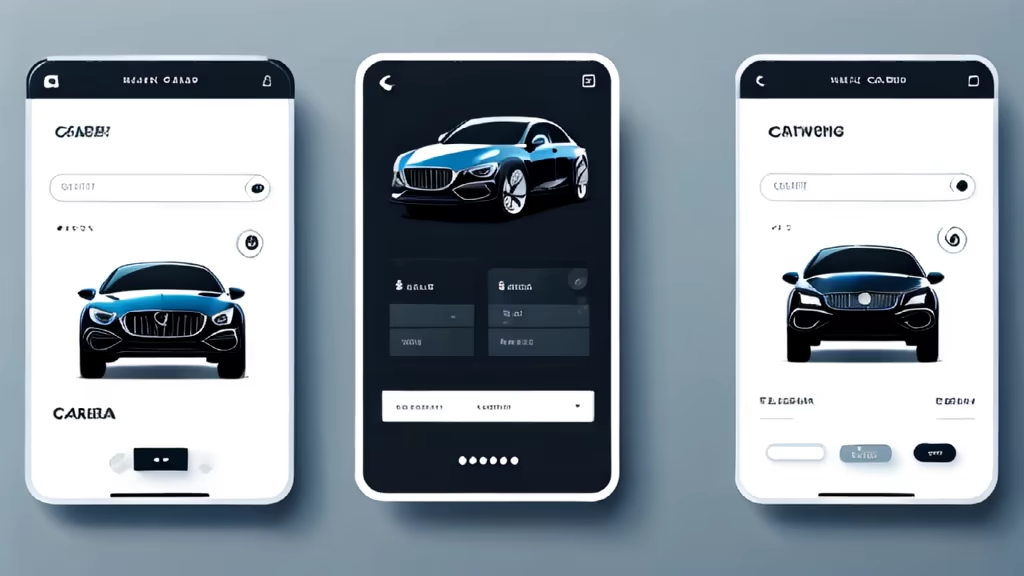
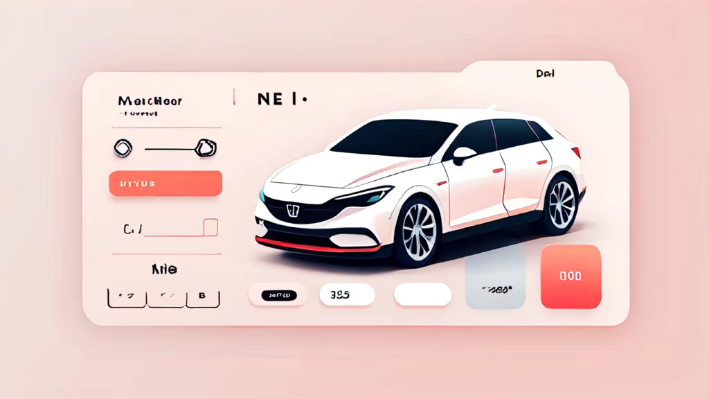
Prompt: modern food delivery app, user interface, ui, ux, uiux, Figma, Behance, HQ, 4K, clean UI, blender


Prompt: Design a sophisticated and minimalist image for a website and app dedicated to recipe search and creation. The logo should embody the essence of modern culinary art, combining simplicity with elegance. Incorporate iconic cooking symbols like a whisk, or a simple, stylized representation of ingredients or utensils. The color scheme should be muted and refined, possibly using shades of black, cream, or subtle terracotta, with a potential accent color like gold or deep green for a touch of sophistication. The image must be versatile, looking equally impressive on a website header as well as a mobile app icon. It should be easy to recognize and memorable, capturing the spirit of a high-end culinary experience while maintaining a clean, uncluttered design. The font used for any text should be modern and sleek, complementing the overall minimalist aesthetic of the image. This image aims to attract food enthusiasts who appreciate a refined, user-friendly platform for their culinary explorations. no text.
Negative: text
Style: Digital Art


Prompt: A festive anthropomorphic Chinese dragon stands in front of the Palace Museum style buildings
Style: Fantasy Art


Prompt: The UI design is a canvas bathed in the soft glow of innovation, where minimalist elegance meets boundless creativity. Navigating through the website is akin to strolling through a sunlit garden, each element strategically placed to evoke a sense of clarity and purpose. The whitespace is not just empty space but a breath of fresh air, allowing ideas to bloom and information to breathe.


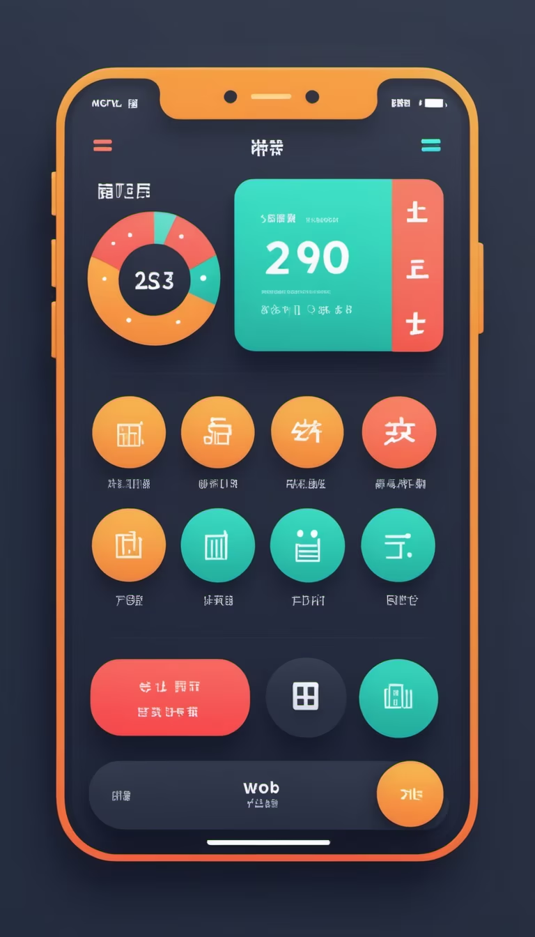
Prompt: Help me design a main interface for a mobile app. The app is a collection of utility tools, and it should be in Chinese with a vertical layout. The bottom of the screen should have a tab bar, or you can use your imagination to create a stunning design. The color scheme should be bold but not extravagant, and it can subvert traditional design styles.


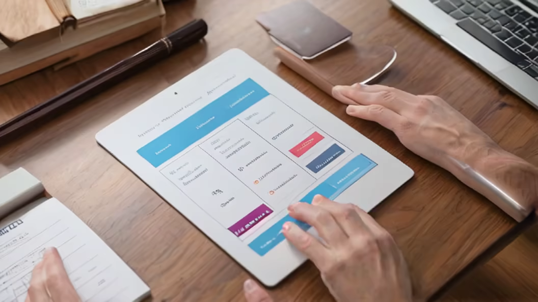
Prompt: Clear and concise manual layout design, using concise fonts and appropriate font sizes, segmented content, using clear titles and numbering, accompanied by simple and easy to understand illustrations for users to understand. The overall style emphasizes the organization and layout of information, ensuring clear presentation of content, clear chapters, clear and easy to read fonts, a combination of graphics and text, and a reasonable structure - ar 4:3


Prompt: develop a framework for the main page of the service, which helps customers find tenders, view information about them and order services related to these tenders. ux design


Prompt: Design a compelling user interface (UI) and user experience (UX) for a web platform. Center the design around a card housing a table. Each row of the table should convey relevant information, while an unique interactive feature, reminiscent of a piano, is integrated between the rows. This feature takes the form of a circular button, providing users with the ability to dynamically add new list entries. Upon clicking the button, it should expand to accommodate the input of new information. The design should balance aesthetics and functionality, emphasizing improved user interaction and usability. Ensure that the color palette aligns with MidJourney's brand colors, and that the UI functions seamlessly across various devices and screen sizes. Provide a brief documentation explaining the design decisions and how the piano-inspired feature enhances the user experience.