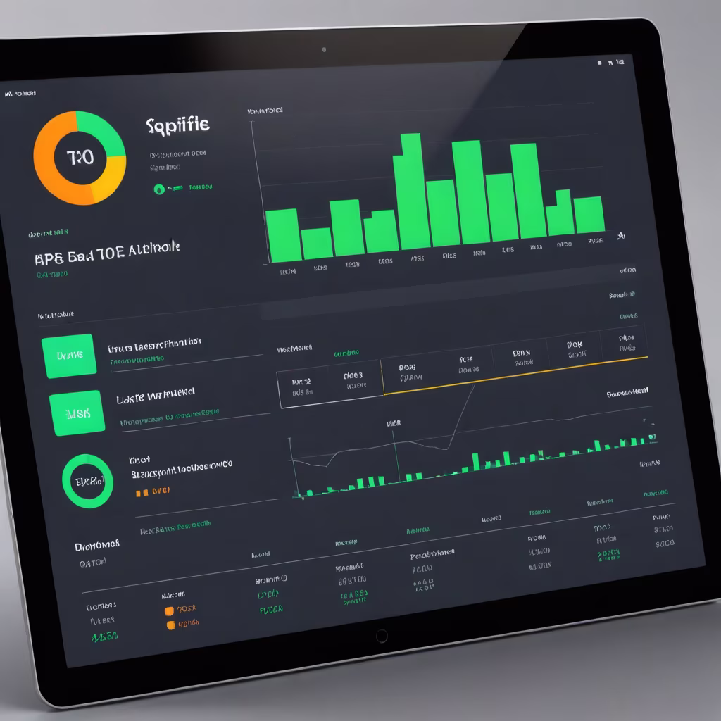
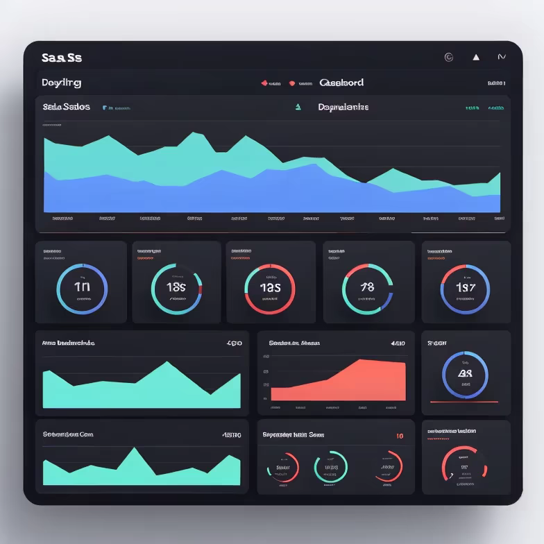
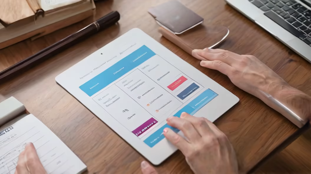
Prompt: create a dashboard for portfolio details page with most useful kpis. In this page we will displaying the list of stocks that are added to the portfolio


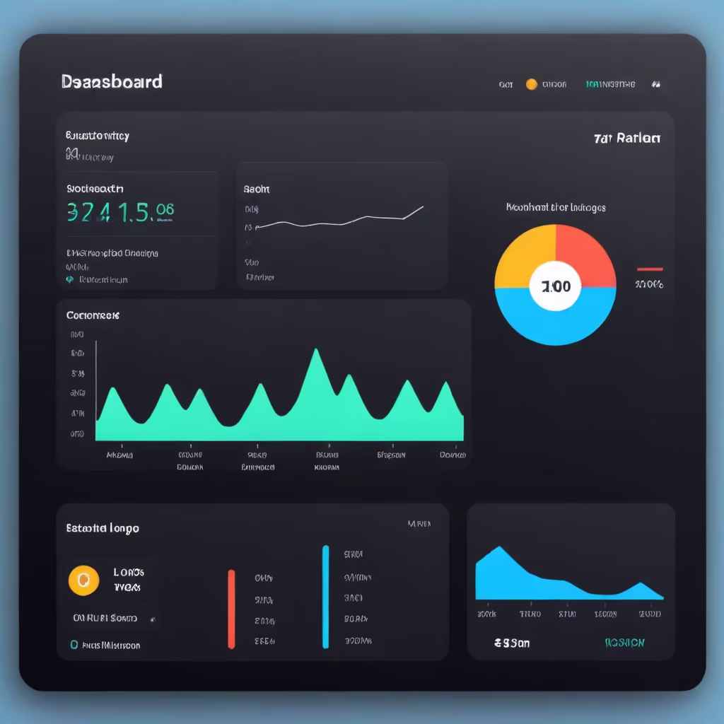


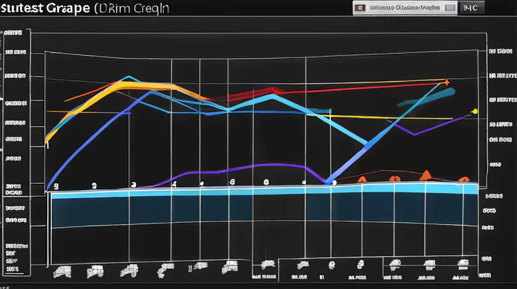
Prompt: Generate a dashboard for Microsoft, highlighting revenue from different business segments and cloud services usage.\"


Prompt: Generate an image that visually represents the importance of diversifying a financial portfolio. The concept is that it's crucial not to put all your money in a single project. Some projects may not move at all, and money is always rotating. Use creative visuals to convey the idea of spreading investments across various assets for a well-balanced and resilient portfolio.


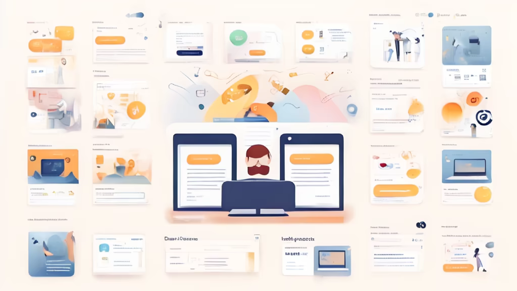
Prompt: Generate a user interface design for a portfolio website that embodies a clean and detailed aesthetic. Consider incorporating modern design elements, intuitive navigation, and visually appealing graphics to enhance the overall user experience. Provide a desktop and mobile version to ensure a seamless transition between devices. Focus on showcasing the individual's skills and achievements in a visually compelling manner while maintaining a minimalist and professional look


Prompt: web desgn ux, ui, ux/ui, Create a comprehensive portfolio showcasing my skills and achievements as a software engineer. The portfolio should include a visually appealing and organized webpage that highlights my expertise, projects, and experience in the field of software development. The portfolio should have separate sections: 1. **Introduction**: Craft a brief introduction that outlines my passion for software engineering, my approach to problem-solving, and my commitment to creating, Figma design, front view, beautiful, modern


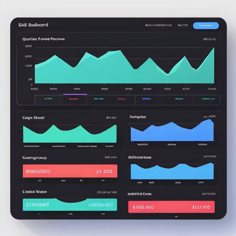
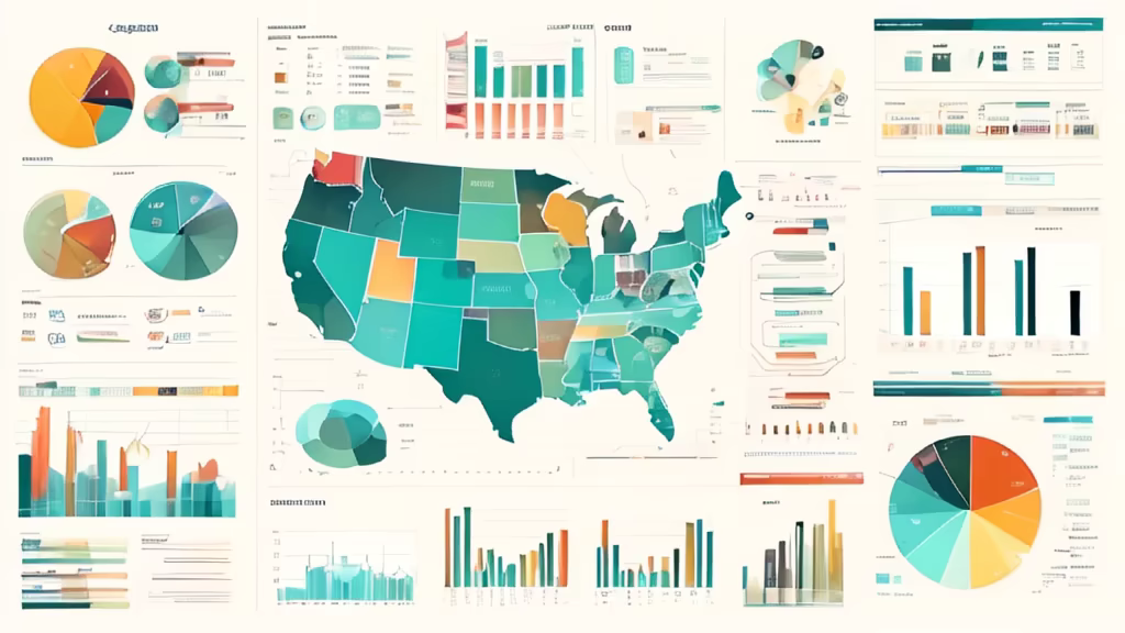
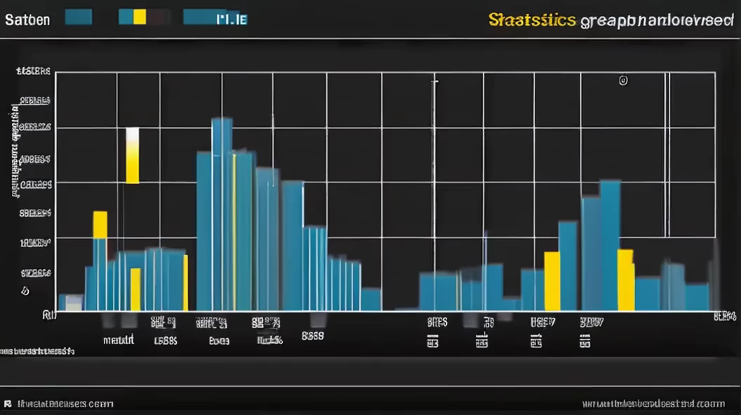
Prompt: \"Market Overview - Create an informative visual representation of a market overview. The image should convey key data, trends, and insights about a specific market or industry. Medium: Visual market overview representation. Style: Choose a style that communicates professionalism and data-driven insights. Resolution: High-quality to ensure clarity of data. --ar 16:9 --v 5.1 --style informative --q 2 --s 750.

Prompt: develop a framework for the main page of the service, which helps customers find tenders, view information about them and order services related to these tenders. ux design
Prompt: Design a web page interface where users can seamlessly choose between two services - one tailored for professionals and the other for individuals. Create an intuitive layout with clear sections for each category. Utilize a harmonious color scheme, modern typography, and interactive elements to enhance the user experience. Ensure the design is visually appealing and user-friendly


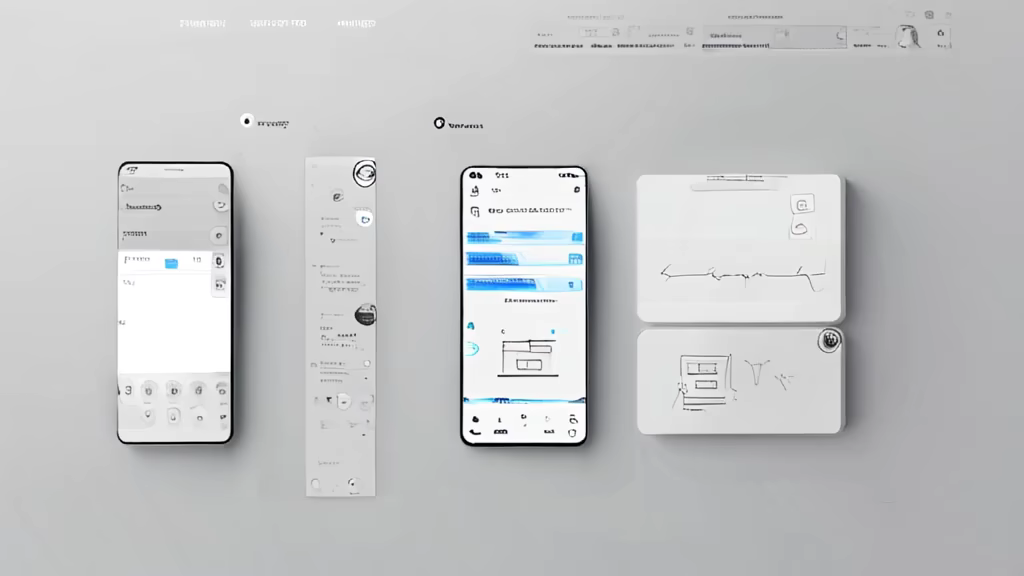
Prompt: create a seamless UI that works for Pc, Tablet and smartphone and application once created could be easily shared among
Prompt: ux/ui page
Negative: ugly, deformed, noisy, blurry, distorted, out of focus, bad anatomy, extra limbs, poorly drawn face, poorly drawn hands, missing fingers


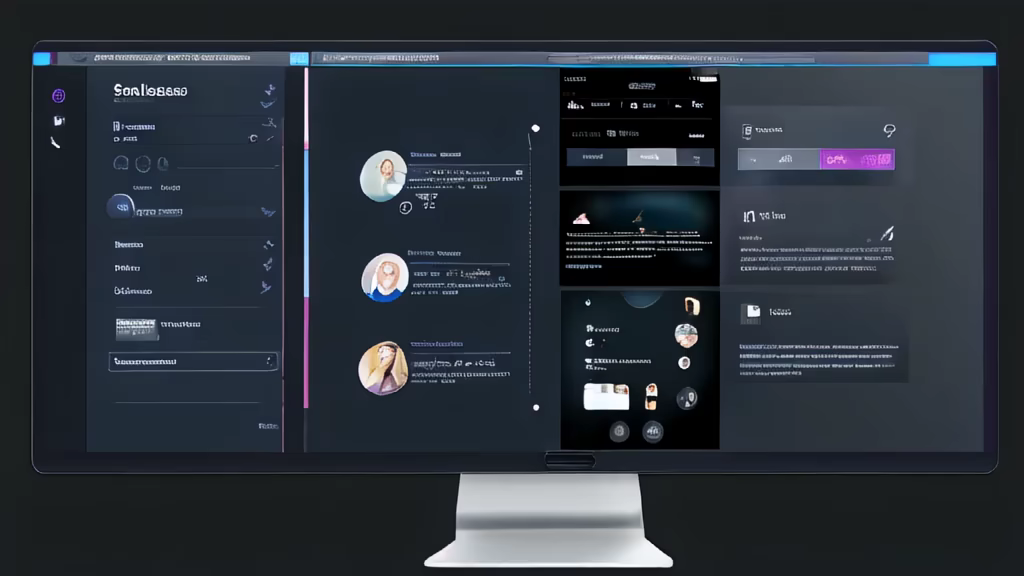
Prompt: Design a compelling user interface (UI) and user experience (UX) for a web platform. Center the design around a card housing a table. Each row of the table should convey relevant information, while an unique interactive feature, reminiscent of a piano, is integrated between the rows. This feature takes the form of a circular button, providing users with the ability to dynamically add new list entries. Upon clicking the button, it should expand to accommodate the input of new information. The design should balance aesthetics and functionality, emphasizing improved user interaction and usability. Ensure that the color palette aligns with MidJourney's brand colors, and that the UI functions seamlessly across various devices and screen sizes. Provide a brief documentation explaining the design decisions and how the piano-inspired feature enhances the user experience.
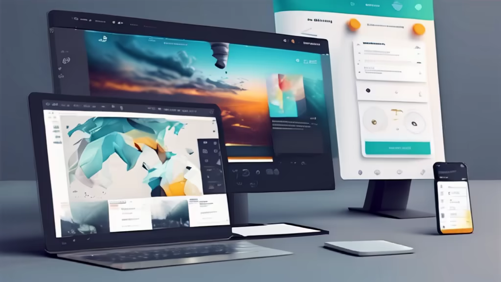
Prompt: A visually stunning portfolio website showcasing UI and UX design. The design features a clean and modern layout with vibrant colors that grab attention. The website incorporates smooth transitions and intuitive navigation for a seamless user experience. The portfolio section highlights a diverse range of projects, demonstrating the designer's expertise in creating impactful and user-friendly interfaces


Prompt: A visually stunning portfolio website showcasing UI and UX design. The design features a clean and modern layout with vibrant colors that grab attention. The website incorporates smooth transitions and intuitive navigation for a seamless user experience. The portfolio section highlights a diverse range of projects, demonstrating the designer's expertise in creating impactful and user-friendly interfaces
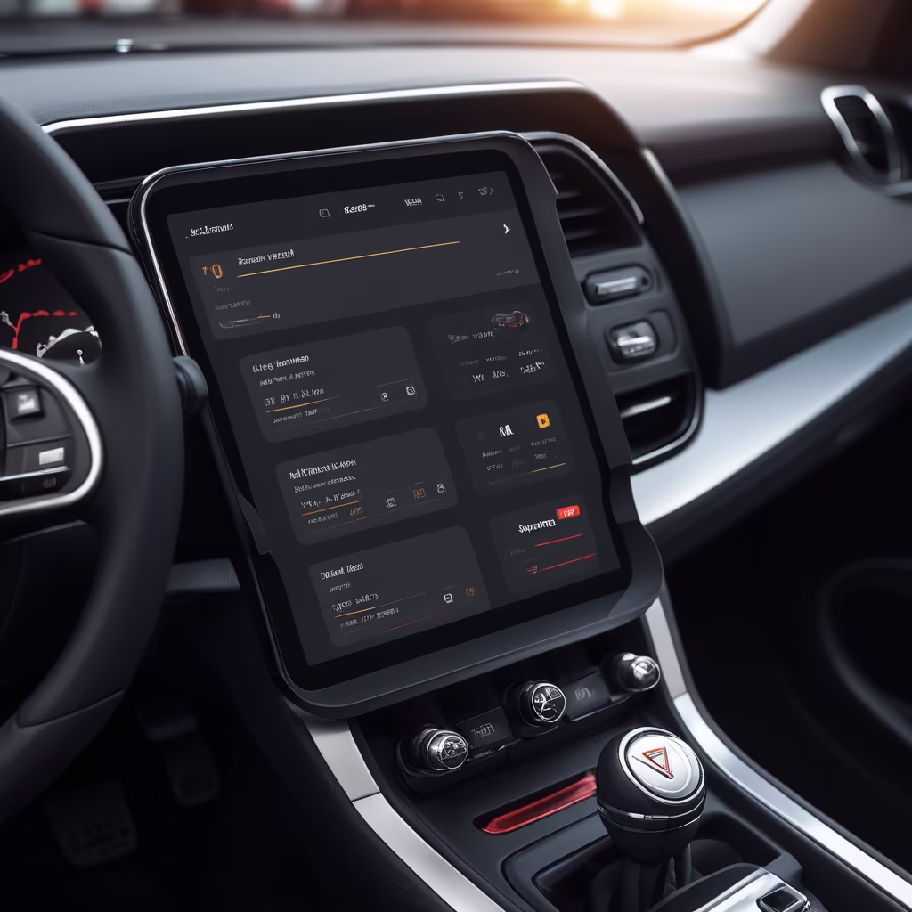
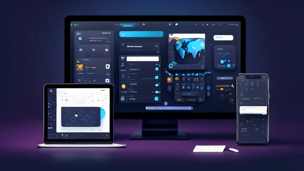
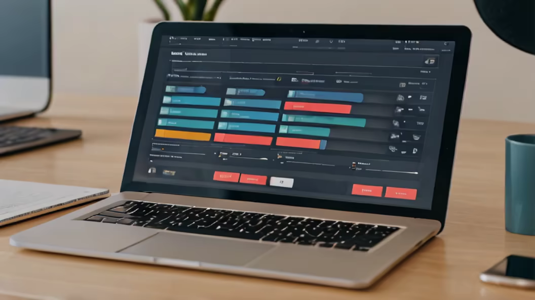
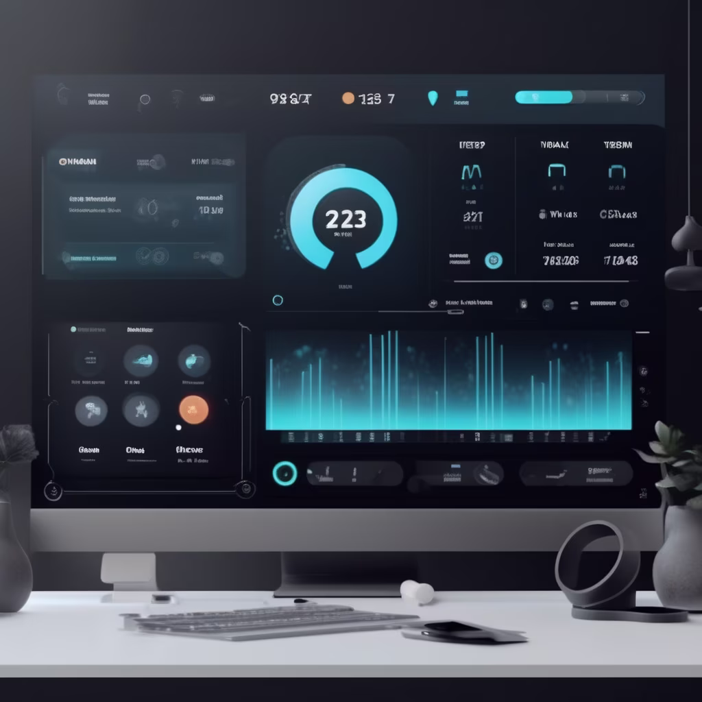
Prompt: Create a futuristic AI-driven dashboard for a smart home system that seamlessly integrates with Internet of Things (IoT) devices, focusing on a sleek and minimalist design with interactive data visualizations.


Prompt: an air filter app mobile interface for a different functions and buttons on it UI/UX, minimalist with logo and charts, functionality, stylist


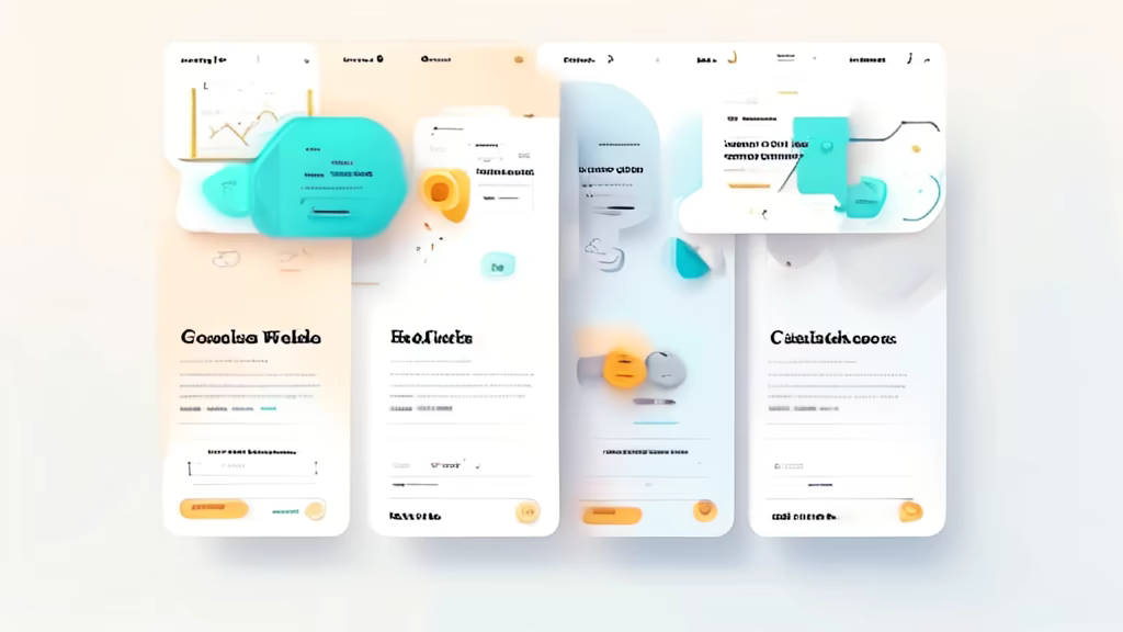
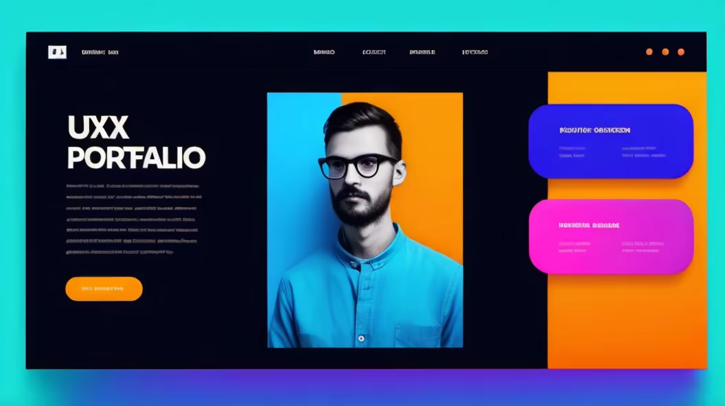
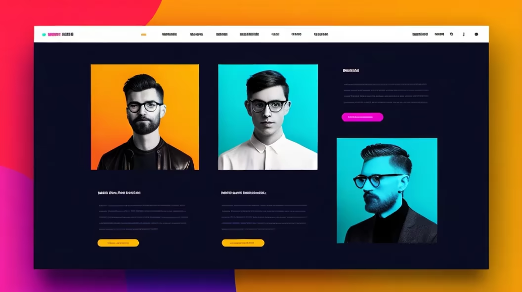
Prompt: A Portfolio UI, Portfolio user Interface cantain Profile Pic, Name, short info, list of skils, project list, contact me section, Figma, UI/UX, realistic, front view, web view
Negative: photography, ugly, random picture, side view


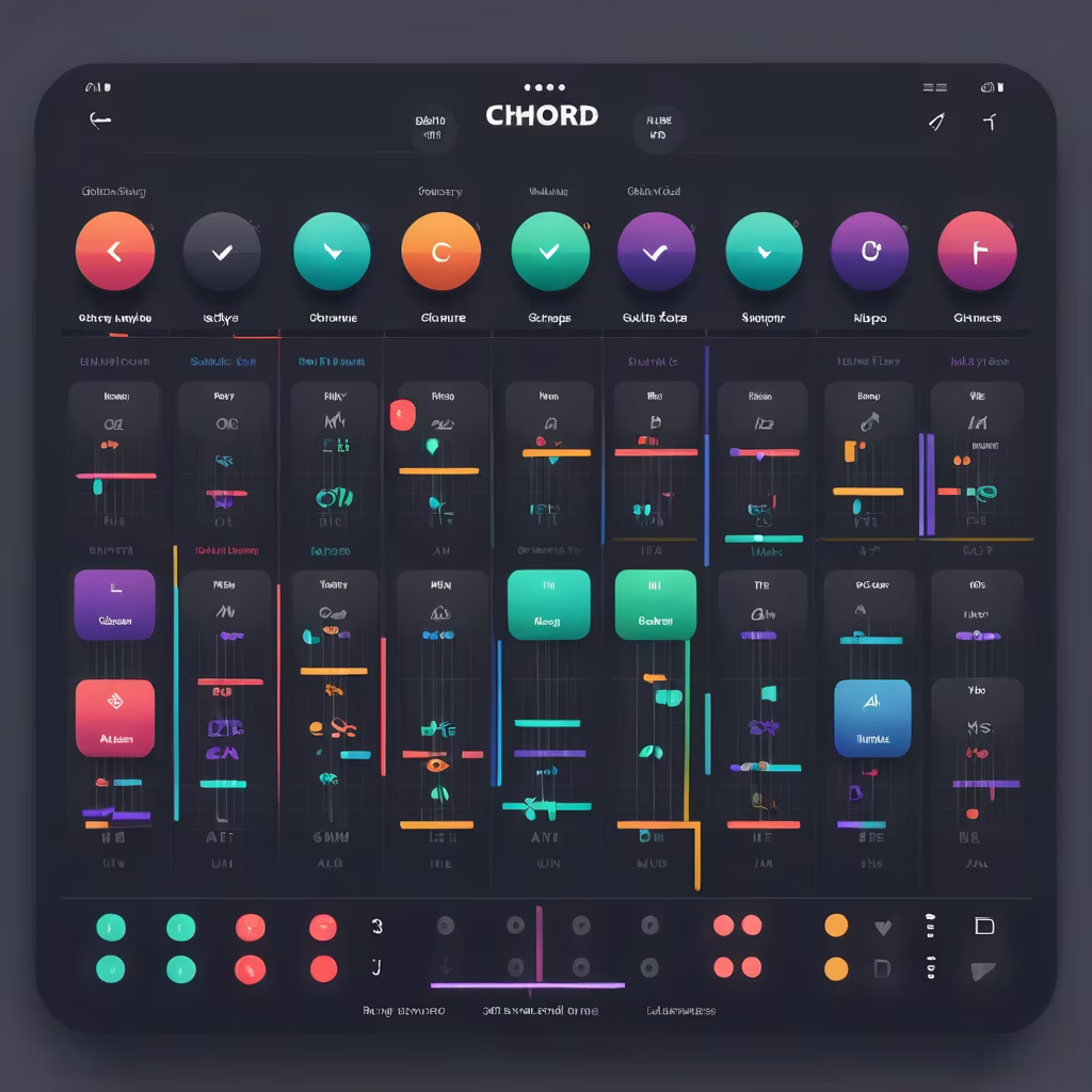
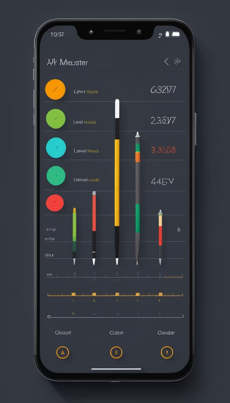
Prompt: Design a simple home screen that displays all the chord charts, sorted by note or chord type. Use intuitive ICONS or colors to enable users to quickly find chords they are interested in

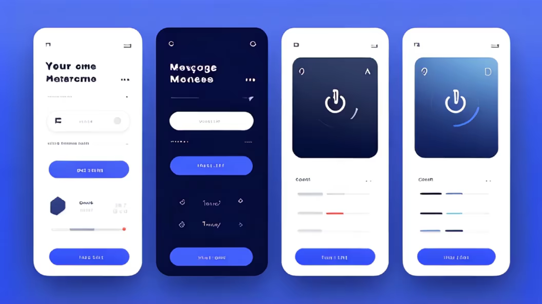
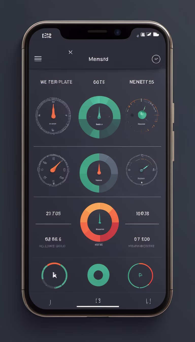
Prompt: Design a main interface for a mobile app for me, with a vertical layout. The bottom of the screen should have a tab bar, or feel free to use your imagination for a unique design.


Prompt: Design a main interface for a mobile app for me, with a vertical layout. The bottom of the screen should have a tab bar, or feel free to use your imagination for a unique design.


Prompt: Please help me design the UI interface for an Android tool app. The main functions of this app include various measurement tools such as a noise meter, ruler, protractor, distance measurement, level, compass, and others commonly found on smartphones. Design an elegant layout that organizes these tools effectively on the interface. The color scheme should reflect the characteristics of a utility app, and the design should be unique, standing out from common designs.


Prompt: New Year postcard, full body, astronaut, moon landscape, glow, halo, sparks of light, snowflakes, splashes of light, Christmas tree decorated with toys, gifts, extremely detailed magical complex dream moon base background, space, planets, constellations, galaxies, starcraft style, 70s, detailed, vibrant color, soft light, highly detailed face, high quality, bright soft light, realistic, with interesting new year elements, by Alex Ross Chris Foss
Negative: low quality, low-grade, twins, duplicate, fused finger, missing arm, missing leg, extra finger, poorly drawn hand, poorly drawn face, deformed, bad proportion, cloned face, disfigured, extra limb, bad anatomy, gross proportion, malformed limb,extra legs, extra arms, identical positions, duplicates, repeats, ultra realistic, no expression, blurry, 3d, ugly face, low detail, empty background, out of crop,
Style: Comic Book


Prompt: A Portfolio UI, Portfolio cantain Profile Pic, Name, short info, list of skils, project list, contact me section, Figma, UI/UX, realistic, front view, web view
Negative: ugly, poor hand design, side view,


Prompt: The UI design is a canvas bathed in the soft glow of innovation, where minimalist elegance meets boundless creativity. Navigating through the website is akin to strolling through a sunlit garden, each element strategically placed to evoke a sense of clarity and purpose. The whitespace is not just empty space but a breath of fresh air, allowing ideas to bloom and information to breathe.


