Prompt: Design a compelling user interface (UI) and user experience (UX) for a web platform. Center the design around a card housing a table. Each row of the table should convey relevant information, while an unique interactive feature, reminiscent of a piano, is integrated between the rows. This feature takes the form of a circular button, providing users with the ability to dynamically add new list entries. Upon clicking the button, it should expand to accommodate the input of new information. The design should balance aesthetics and functionality, emphasizing improved user interaction and usability. Ensure that the color palette aligns with MidJourney's brand colors, and that the UI functions seamlessly across various devices and screen sizes. Provide a brief documentation explaining the design decisions and how the piano-inspired feature enhances the user experience.
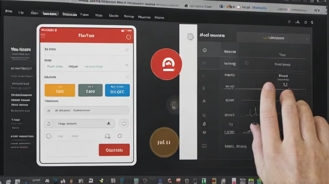
Prompt: webdesign ui/ux: a table in a card with list entries, between the rows there is also a round button where list entries can be written, similar to a piano, the button should be a circle and you should be able to expand it by clicking on it.


Prompt: webdesign ui/ux: eine tabelle in einer karte mit listeinträgen, zwischen den zeilen gibt es auch einen runden button wo listeinträge geschrieben werden können, ähnlich wie bei einem klavier, der button sollte ein kreis sind und man soll ihn durch click aufklappen können.


Prompt: an interesting 3d viewer on the web for a product pass in the building industry, combine the presentation of git with the product pass, ui/ux design


Prompt: an interesting 3d viewer on the web for a product pass in the building industry, ui/ux design


Prompt: use that image \"https://media.licdn.com/dms/image/D4E22AQEbCq99E0odyw/feedshare-shrink_1280/0/1700779354356?e=1704326400\u0026v=beta\u0026t=TNcJ21bRR8W_UQxx6jNLK9eCrPTrr08rr_7zWMMbVgI\" remove background, make a architecture technical drawing in orange blue black and white


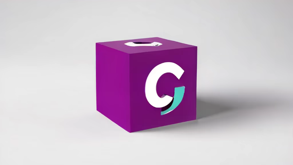
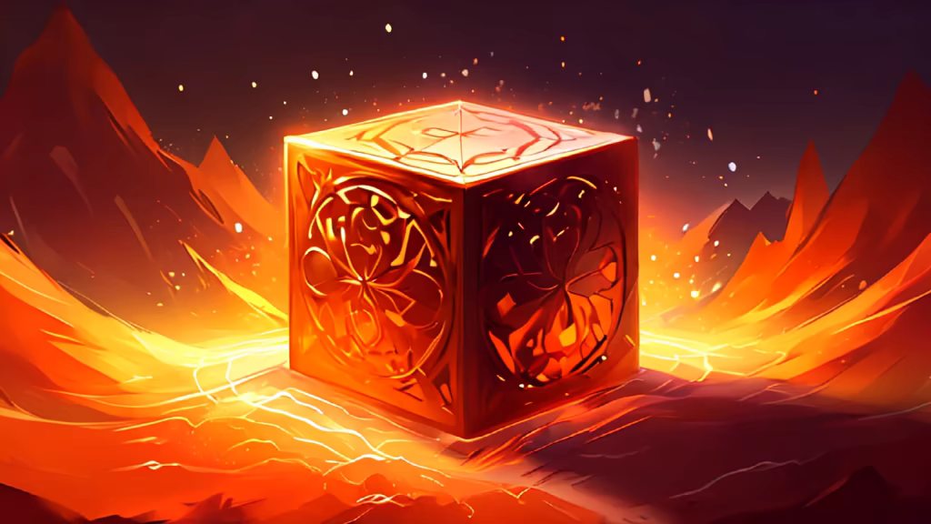
Prompt: a minimalist and modern logo design that creatively merges the essence of a core, similar to the, with the concept of a 3D cube. The logo should be monochromatic, employing a single color orange and black/white to ensure a clean and professional look. Key is to incorporate a recognizable element from a core
Style: Neon Punk


Prompt: a minimalist and modern logo design that creatively merges the essence of a core, similar to the, with the concept of a 3D cube. The logo should be monochromatic, employing a single color orange and black/white to ensure a clean and professional look. Key is to incorporate a recognizable element from a core


Prompt: a minimalist and modern logo design that creatively merges the essence of a core, similar to the, with the concept of a 3D cube. The logo should be monochromatic, employing a single color orange and black/white to ensure a clean and professional look. Key is to incorporate a recognizable element from a core, such as the stylized silhouette of the Octocat.


Prompt: a minimalist and modern logo design that creatively merges the essence of Git, similar to the GitHub logo, with the concept of a 3D cube and core. The logo should be monochromatic, employing a single color orange and black/white to ensure a clean and professional look. Key is to incorporate a recognizable element from the Git logo, such as the stylized tree or the silhouette of the Octocat, to symbolize its connection with Git and GitHub. This should be instantly identifiable to anyone familiar with Git. Core is the Name of the Project.


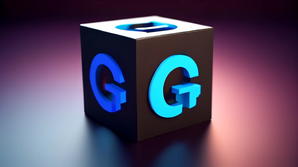
Prompt: a simple, minimalist logo that combines elements of Git (like GitHub) and a 3D cube, only single color orange allowed
Style: Fantasy Art
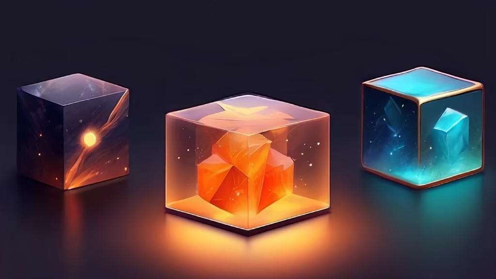
Prompt: a simple, minimalist logo that combines elements of Git (like GitHub) and a 3D cube, only single color orange allowed