


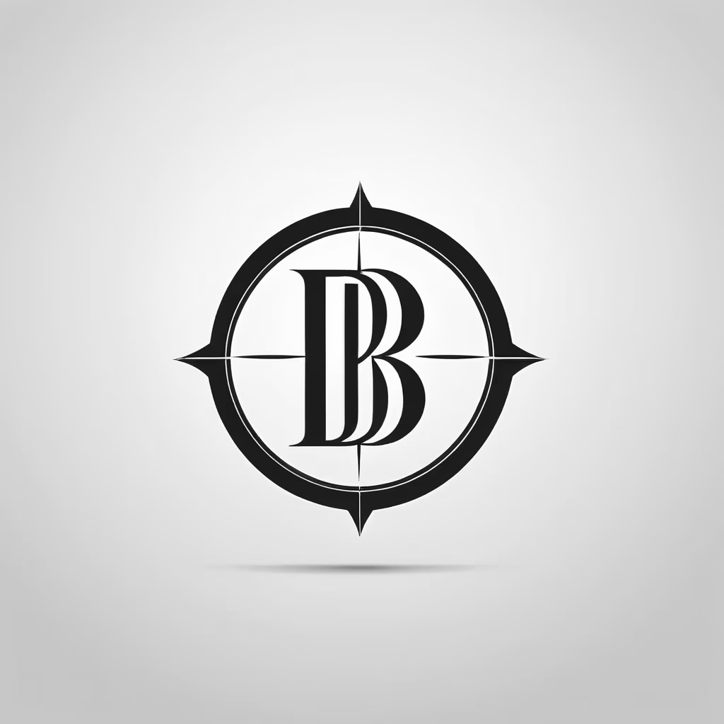


Prompt: The DB Entertainment logo of a K-pop agency. The abbreviation \"DB\" is presented in a modern, elegant and feminine typography.
Style: Photographic


Prompt: The DB Entertainment logo of a K-pop agency. The abbreviation \"DB\" is presented in a modern, elegant and feminine typography.
Style: Sticker


Prompt: The DB Entertainment logo of a K-pop agency. The abbreviation \"DB\" is presented in a modern, elegant and feminine typography.
Style: Comic Book

Prompt: The DB Entertainment logo of a K-pop agency. The abbreviation \"DB\" is presented in a modern, elegant and feminine typography.
Style: Anime

Prompt: The DB Entertainment logo of a K-pop agency. The abbreviation \"DB\" is presented in a modern, elegant and feminine typography.
Prompt: The DB Entertainment logo of a K-pop agency. The abbreviation \"DB\" is presented in a modern, elegant and feminine typography.


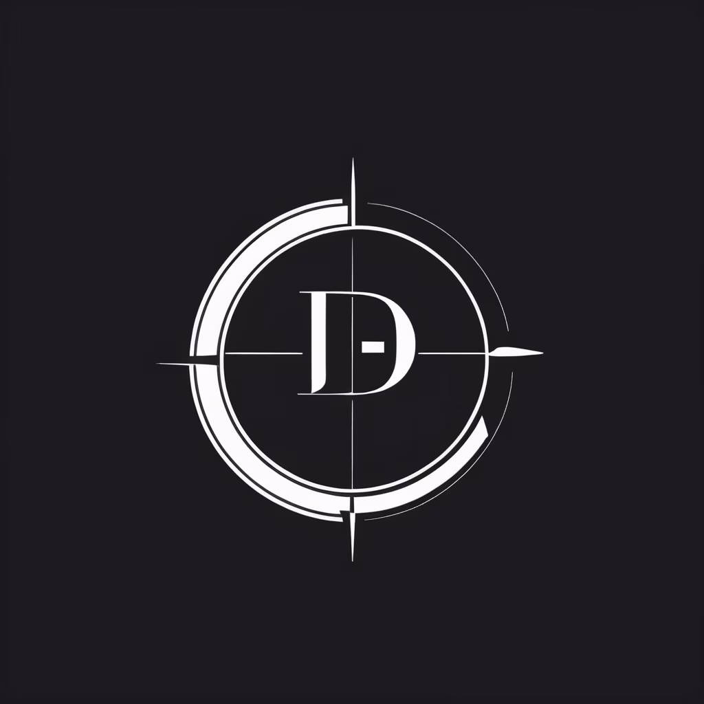
Prompt: DB Entertainment's black and white logo is a minimalist representation of the agency's powerful presence in the K-pop scene. With elegance and simplicity, the logo conveys a sense of timeless sophistication. The abbreviation \"DB\" is presented in a modern, geometric typography, standing out in white against a solid black background.

Prompt: The logo features the abbreviation \"DB\" in a dynamic style, where the letters intertwine fluidly, forming a harmonious fusion. Subtle lines and stylized contours connect the letters. The color palette is blue, purple and pink.


Prompt: The DB Entertainment logo is made up of two letters: D and B, which form a symbol that resembles a diamond. The two letters are stylized to appear to be in motion. The logo's colors are blue and white, which convey a feeling of calm, confidence and professionalism. DB Entertainment's slogan is \"Dream Big\".


Prompt: The lightstick is an elegant and modern object, with colors that remind us of the sea and birds. The body of the lightstick is made of transparent acrylic, in light blue, sky blue and turquoise blue. These colors symbolize the serenity and calm of the sea, which is the main element of the group's concept. The lightstick symbol is a bird, with open wings, also made of transparent acrylic. The bird represents freedom and peace


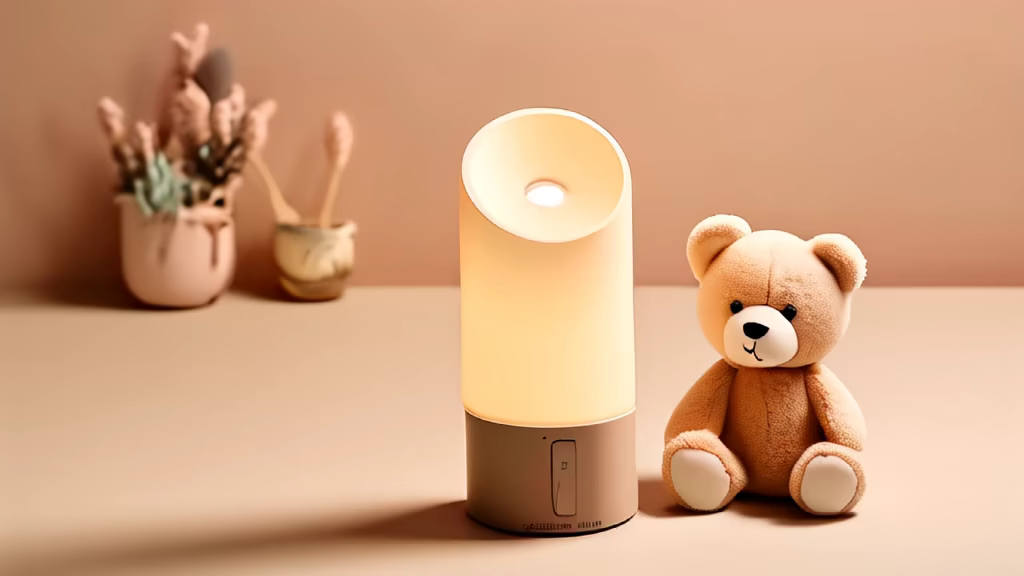
Prompt: The predominant colors are beige, brown and light, which refer to nature and simplicity. The lightstick symbol is a teddy bear, which represents the cuteness and innocence of the group. The teddy bear is made of a bright and colorful material, and is located at the top of the stick. The lightstick has an ergonomic design, which makes it comfortable to hold. It is also very easy to use, with just one button to turn the lights on and off.


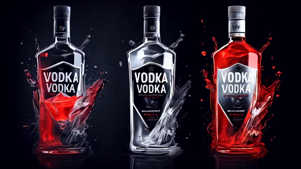
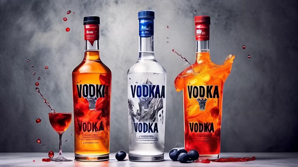
Prompt: produce a photo promoting a Vodka Brand, in such a way that the use of the concept that the \"Medium is the message\" is clear.
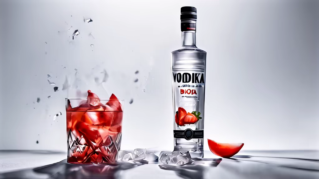
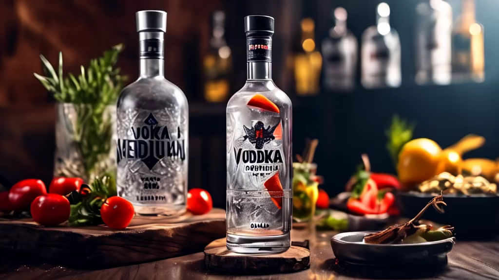
Prompt: produce a photo promoting a Vodka Brand, in such a way that the use of the concept that the \"Medium is the message\" is clear.
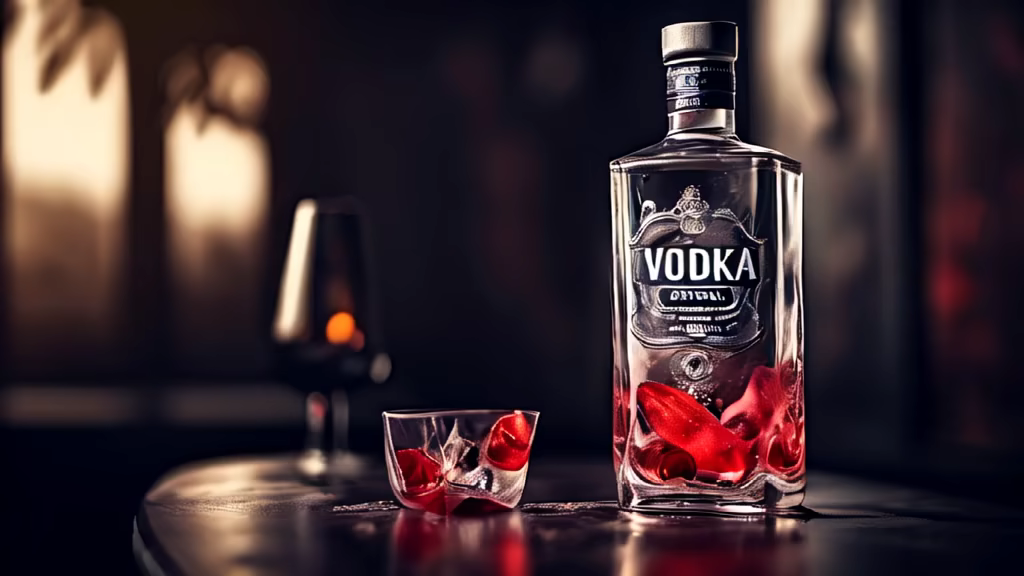
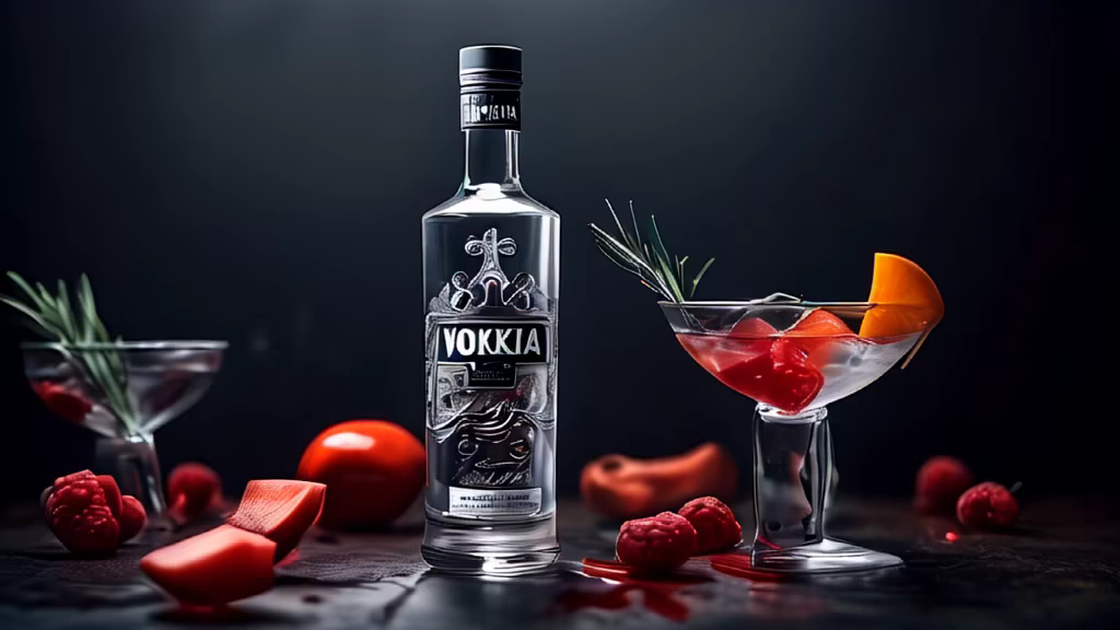
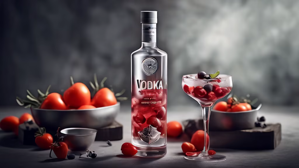
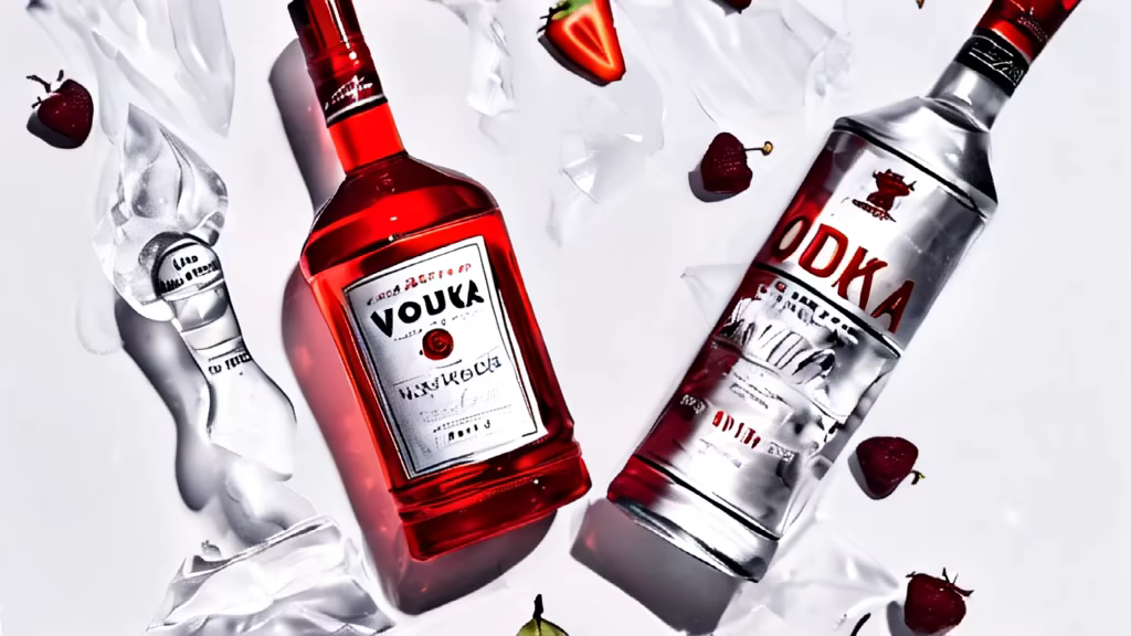
Prompt: create a drawing or produce a photo promoting a Vodka Brand, in such a way that the use of the concept that the \"Medium is the message\" is clear.
Prompt: create an image, realistic design of an 18-story building, modern, stylish, mirrored, delicate and sophisticated, dark tones, of an agency company with a sign with the acronym \"DB\" on the street in Seoul


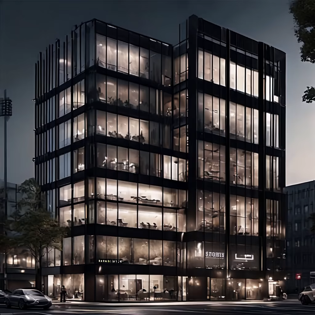

Prompt: create an image, realistic design of an 18-story building, modern, stylish, mirrored, delicate and sophisticated, light colors, of an agency company with a sign with the acronym \"DB\" on the street in Seoul