Prompt: The background is dark, to enhance the visibility of the coloured elements. There is a series of nodes, each of a different colour and several ( 17 blue, 15 orange, 39 red, 14 violet, 15 green), which appear to be represented in 2D. The colours represent different categories of data. Lines connect from left to right, suggesting a flow or transition from one state or position to another. On the right-hand side, the lines converge on distinct end points, each marked by a large dot with a label (\"1\", \"2\", \"3\", \"4\", \"5\"), indicating significant results in the dataset.


Prompt: style realistic The background is dark, probably to improve the visibility of the coloured elements. There is a series of nodes, each of a different colour and several ( 17 blue, 15 orange, 39 red, 14 violet, 15 green), which appear to be represented in 2D. The colours can represent different categories of data. Lines connect these points, running from left to right, suggesting a flow or transition from one state or position to another. On the right-hand side, the lines converge on distinct end points, each marked by a large dot with a label (\\\"1\\\", \\\"2\\\", \\\"3\\\", \\\"4\\\", \\\"5\\\"), indicating significant points or results in the dataset. The multitude of lines and the way they flow and converge could indicate some form of network analysis, data migration or perhaps a visualization of cluster-based machine learning. format : image
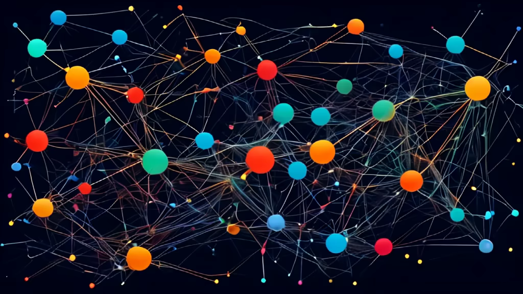

Prompt: style realistic The background is dark, probably to improve the visibility of the coloured elements. There is a series of nodes, each of a different colour and several ( 17 blue, 15 orange, 39 red, 14 violet, 15 green), which appear to be represented in 2D. The colours can represent different categories of data. Lines connect these points, running from left to right, suggesting a flow or transition from one state or position to another. On the right-hand side, the lines converge on distinct end points, each marked by a large dot with a label (\"1\", \"2\", \"3\", \"4\", \"5\"), indicating significant points or results in the dataset. The multitude of lines and the way they flow and converge could indicate some form of network analysis, data migration or perhaps a visualization of cluster-based machine learning. Abstract or normalized data visualizations. This type of visualisation is often used in fields such as data science, statistics and machine learning to represent complex relationships or transformations within a dataset.


Prompt: The background is dark, to enhance the visibility of the coloured elements. There is a series of 5 hot-air balloons, each of a different colour and size. The size changes according to the number of balloons; the larger the number, the bigger the balloon (17 blues, 15 oranges, 39 reds, 14 purples, 15 greens),


Prompt: Le fond est sombre, pour améliorer la visibilité des éléments colorés. Il y a une série de 5 montgolfières, chacun d'une couleur différente et de taille différente la taille change en fonction du nombre, plus le nombre et grand plus la montgolfière est grande ( 17 bleus, 15 oranges, 39 rouges, 14 violets, 15 verts),


Prompt: The background is dark, to enhance the visibility of the coloured elements. There is a series of hot-air balloons, each of a different colour and size. The size changes according to the number of balloons; the greater the number, the bigger the balloon (17 blue, 15 orange, 39 red, 14 violet, 15 green),


Prompt: The background is dark, to enhance the visibility of the coloured elements. There is a series of hot-air balloons, each of a different colour and size. The size changes according to the number of balloons; the greater the number, the bigger the balloon (17 blue, 15 orange, 39 red, 14 violet, 15 green),

