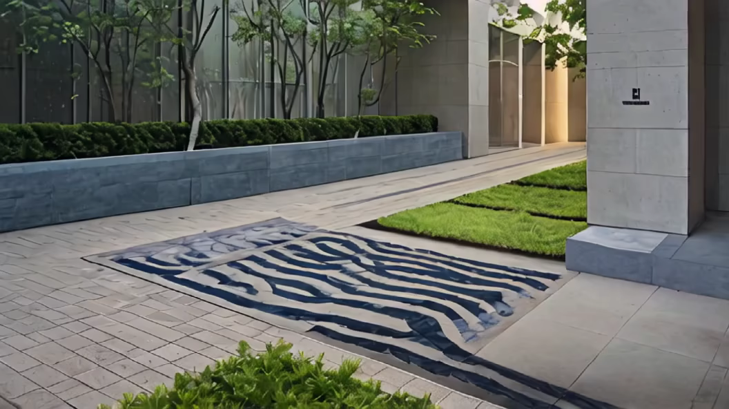
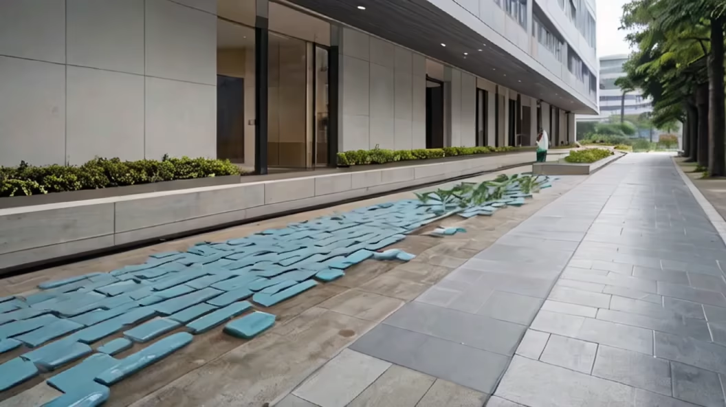
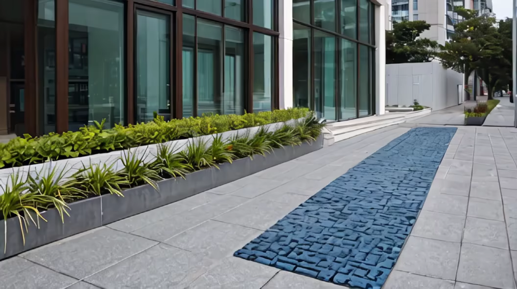
Prompt: The logo for Fujian Shou'an Accessibility Solutions Co., Ltd. embodies the company's commitment to innovation and social responsibility. The design features a dynamic and modern representation of a suspended tactile paving block, symbolizing the company's core product, the floating tactile pathway. The floating design is expressed through a sleek and upward-oriented visual element, suggesting mobility and accessibility. The choice of colors reflects a harmonious blend of inclusivity and environmental awareness. A gradient of cool blues and greens symbolizes the company's dedication to creating accessible and sustainable urban environments. The colors also evoke a sense of tranquility and reliability, emphasizing the company's role in promoting a safe and inclusive society. The typography used for the company name, \"Fujian Shou'an Accessibility Solutions,\" is clean, modern, and bold. It conveys professionalism and reliability, reflecting the diverse expertise of the team members in areas such as market analysis, technology, and finance. In the background, subtle geometric patterns subtly convey the technical and innovative aspects of the company's products. These patterns add a layer of sophistication to the overall design, representing the cutting-edge technology incorporated into the floating tactile pathway. The logo captures the essence of Fujian Shou'an Accessibility Solutions Co., Ltd. as an innovative and socially responsible company dedicated to providing inclusive solutions for urban accessibility. This design aims to inspire confidence, trust, and a sense of progress in the field of accessibility and urban development.