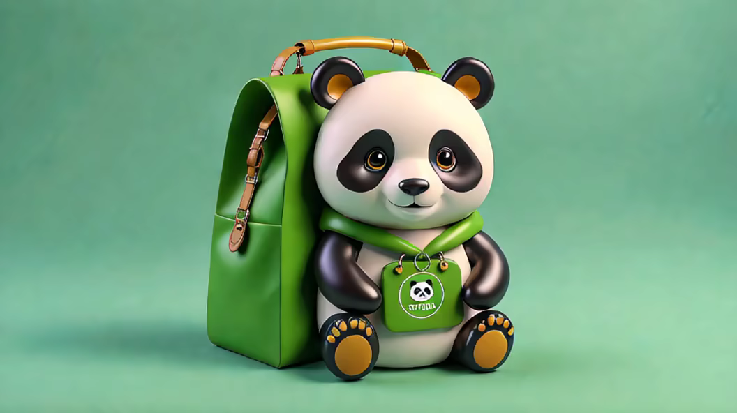
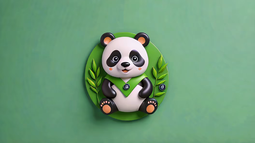
Prompt: Primary Subject: The main subject of the icon is a panda, which should be stylized and central to the composition. Color Palette: The panda's primary colors are black and white to emphasize its traditional appearance. The background color should be a vibrant green to signify nature and freshness. Positioning \u0026 Layout: Ensure the panda is positioned centrally to draw focus. Surround the panda with green bamboo leaves to establish its natural habitat and tie in the green color theme. Facial Features: The panda should have a gentle and welcoming expression with a slight smile to resonate with customers. Eyes should be proportionate, conveying friendliness and trustworthiness. Additional Elements: Incorporate subtle elements that indicate shopping or commerce, such as a small shopping cart or bag beside the panda. This will establish a clear connection between the panda and the shop's theme. Icon Shape \u0026 Size: Opt for a circular badge or emblem shape for versatility and easy recognition. Ensure the icon is scalable, making it suitable for various applications such as website favicon, app icon, or print material. Typography (Optional): If incorporating text, use a modern, clean font for the shop's name \"wegopanda\" positioned strategically either below the panda or along the circular badge's circumference.