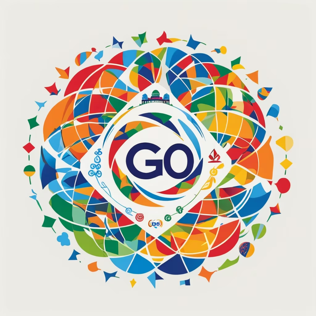
Prompt: The new logo of the G20 features a combination of powerful symbols and modern design elements. The central focus of the logo is a globe, symbolizing global unity and cooperation. The globe is depicted in vibrant colors, representing the diversity and interconnectedness of the G20 member countries. Embracing the globe is a circular emblem that represents unity and harmony. It consists of intertwining arcs and lines, forming a continuous loop. This emblem signifies the collaborative efforts and continuous dialogue among the G20 nations to address global challenges. Surrounding the central emblem are twenty smaller icons, each representing one member country of the G20. These icons take the shape of various landmarks, national symbols, or elements that are unique to each country, showcasing their individual identities within the context of the G20 community. The typography used for the G20 logo is contemporary and sleek, conveying a sense of professionalism and progress. The text \"G20\" is prominently displayed beneath the emblem, with the numbers and letters gracefully intertwined.

