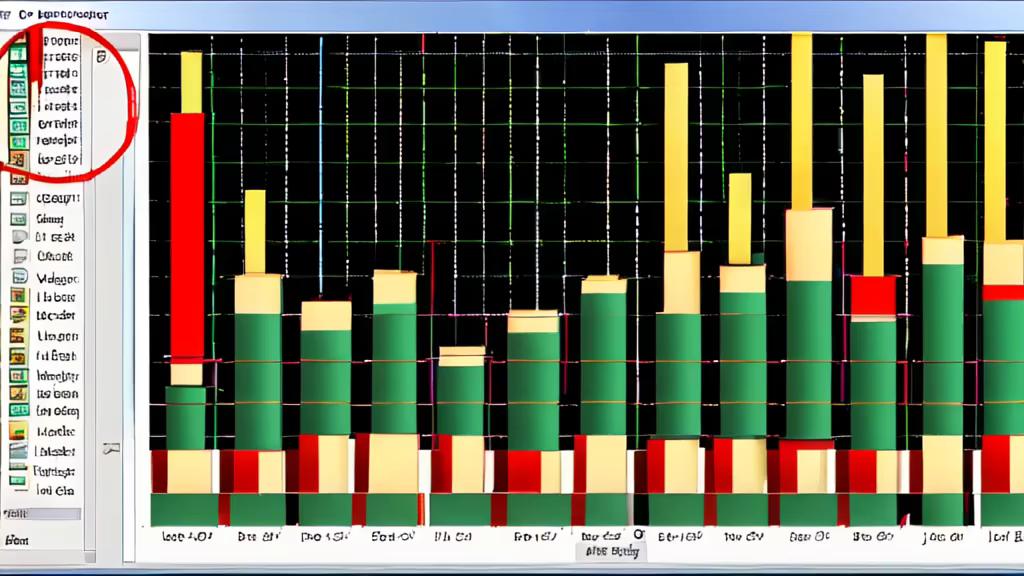
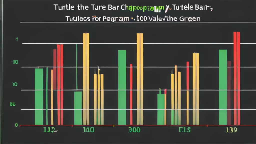
Prompt: Modify the turtle bar chart program from the previous chapter so that the bar for any value of 200 or more is filled with red, values between [100 and 200) are filled yellow, and bars representing values less than 100 are filled green.


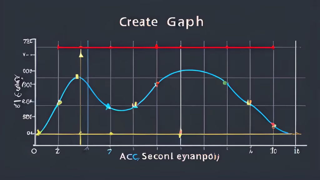
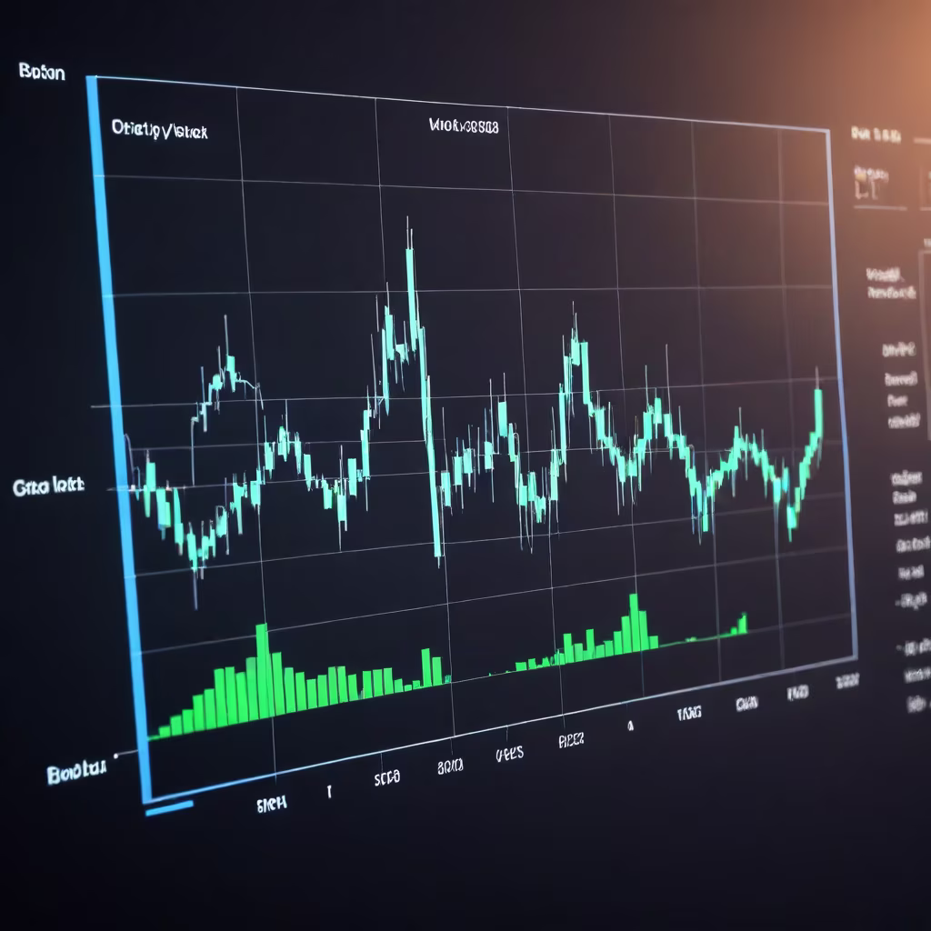
Prompt: create a 2 line graphs in a single chart where the first graph is slightly above the seccond graph and the randomly add some flat lines the graph should also look like matplotlib was used and the title is \"acc vs v-acc\" x_labels = [0, 20, 40, 60, 80, 100, 120, 140] y_labels = [0, 0.65, 0.70, 0.75, 0.80, 0.85, 0.90]

Prompt: In the two-dimensional image, there is an oblique flat yellow square with a red stroke in the middle of the pure mint green background.


Prompt: In the two-dimensional image, there is a diagonal flat yellow square with a red three-dimensional shadow in the middle of the pure mint green background.


Prompt: Abstract art composed of grey, yellow, cyan, light-green, magenta, red, blue parallel vertical lines


Prompt: Create a transparent PNG image containing an icon for digital analysis and a bar chart. The image should be simple and clear, avoiding complexit


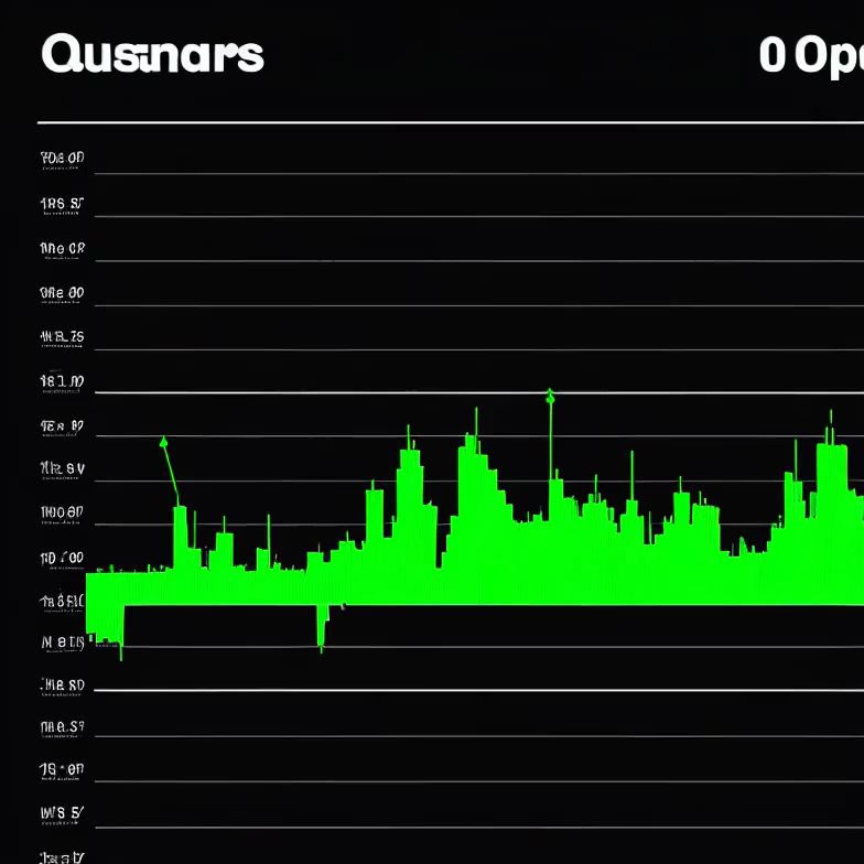
Prompt: Show me a sample chart that measures the total wealth of adults in the U.S. relative to age.


Prompt: Abstract art composed of yellow, cyan, light-green, magenta, red, blue parallel vertical lines, geometric


Prompt: Generate a conical shaped image, inverted cone, colors red, orange, yellow, green, blue, pink from bottom to top


Prompt: Generate an image with a sharp focus and a splash of paint using a red and yellow color gel.


Prompt: Code migration from bad code to good code. The code may be simplified to colored lines that represent code structure. Take a deep breath and focus on bringing home the concept that spagethetti code is bad and DRY code is good


Prompt: \"Please help me create a framework diagram according to the following requirements.\"Create a machine learning model that can predict the average price of a house based on its features. The specific steps are as follows:Reading data in Python Defining problem statement Identifying target variable Checking the distribution of the target variable Basic Data Exploration Rejecting unnecessary columns Exploratory Data Analysis for data distribution (Histograms and Bar plots) Feature selection based on data distribution Outlier handling Missing value treatment Visual correlation analysis Statistical correlation analysis (Feature Selection) Converting data to numerical for ML Sampling and K-fold Cross Validation Trying multiple regression algorithms Choosing the best model Deploying the best model in production environment
Prompt: create a simple, colorful data visualization graphic to visualize two data points: (1) 100+ building facilities (2) 10 million+ sq ft of building space.


Prompt: generate image to represent real estate business , show plots for sale , use only red color to represent image


Prompt: Circle: Represents the overall shape. Green Paw: Positioned at the center of the circle, green symbolizes vitality and nature. Red Bull Head: Trying to break free from the paw, red represents strength and impulse. Three K-lines: Forming a V-shape, the first one is green, and the next two are red. K-lines represent market fluctuations, and the V-shape may suggest change or reversal.


Prompt: style realistic The background is dark, probably to improve the visibility of the coloured elements. There is a series of nodes, each of a different colour and several ( 17 blue, 15 orange, 39 red, 14 violet, 15 green), which appear to be represented in 2D. The colours can represent different categories of data. Lines connect these points, running from left to right, suggesting a flow or transition from one state or position to another. On the right-hand side, the lines converge on distinct end points, each marked by a large dot with a label (\"1\", \"2\", \"3\", \"4\", \"5\"), indicating significant points or results in the dataset. The multitude of lines and the way they flow and converge could indicate some form of network analysis, data migration or perhaps a visualization of cluster-based machine learning. Abstract or normalized data visualizations. This type of visualisation is often used in fields such as data science, statistics and machine learning to represent complex relationships or transformations within a dataset.


Prompt: style realistic The background is dark, probably to improve the visibility of the coloured elements. There is a series of nodes, each of a different colour and several ( 17 blue, 15 orange, 39 red, 14 violet, 15 green), which appear to be represented in 2D. The colours can represent different categories of data. Lines connect these points, running from left to right, suggesting a flow or transition from one state or position to another. On the right-hand side, the lines converge on distinct end points, each marked by a large dot with a label (\\\"1\\\", \\\"2\\\", \\\"3\\\", \\\"4\\\", \\\"5\\\"), indicating significant points or results in the dataset. The multitude of lines and the way they flow and converge could indicate some form of network analysis, data migration or perhaps a visualization of cluster-based machine learning. format : image


Prompt: generate a image with complete white background and use only red color to represent cristmass event. a cristmass tree must be ocean green color


Prompt: Generate an image showing the development trend and market size of the integrated circuit industry at home and abroad, including some chip production, sales, market share and other data, as well as some maps and charts, the style of business statistics, the color is yellow and blue, the background is white.


Prompt: Abstract art composed of yellow, cyan, light-green, magenta, red, blue parallel vertical lines, in the style of TV static, geometric


Prompt: The background is dark, to enhance the visibility of the coloured elements. There is a series of nodes, each of a different colour and several ( 17 blue, 15 orange, 39 red, 14 violet, 15 green), which appear to be represented in 2D. The colours represent different categories of data. Lines connect from left to right, suggesting a flow or transition from one state or position to another. On the right-hand side, the lines converge on distinct end points, each marked by a large dot with a label (\"1\", \"2\", \"3\", \"4\", \"5\"), indicating significant results in the dataset.


Prompt: a cross (red), in the background green and light green stripes, logo design, text in the middle \\ FRD \\


Prompt: a cross (red), in the background green and light green stripes, logo design, text in the middle \\ FRD \\
Negative: random letters (just FRD), green inside of the cross


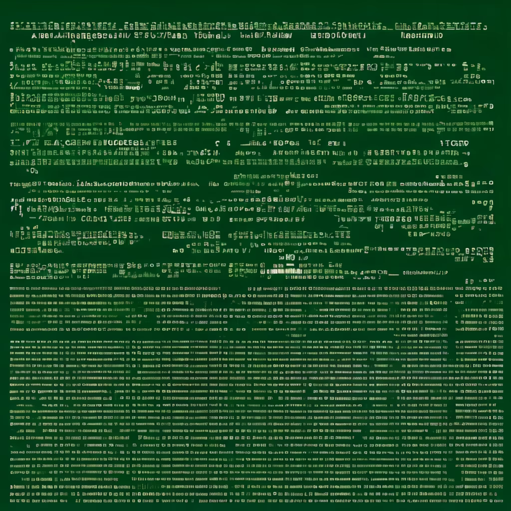
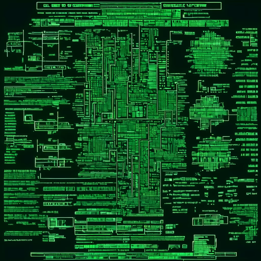
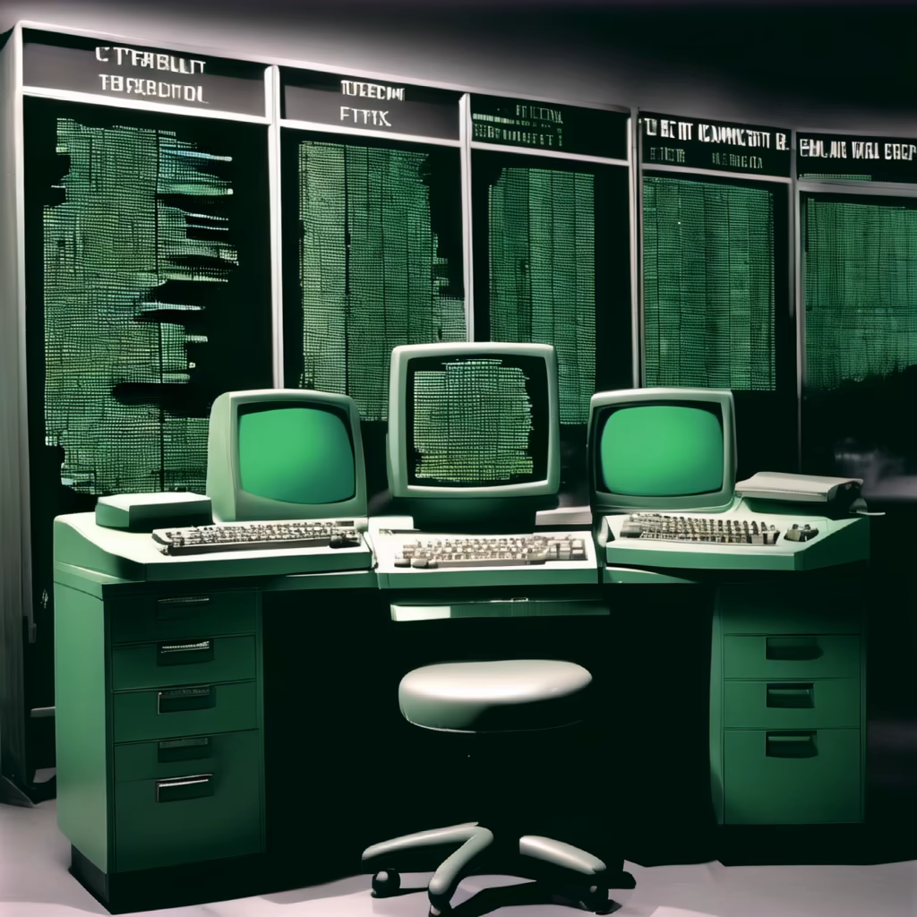
Prompt: Generate a GIF of text scrolling on a front-facing, old DOS-style screen. The text should be displayed in green monochrome, and it should scroll smoothly, resembling the classic terminal screens from the early days of computing. The scrolling text should be reminiscent of the retro computer era, adding a nostalgic touch to the animation


Prompt: Generate an image of a landscape with a yellow and green color gel lighting effect, with a focus on the shadows and textures of the environment.


Prompt: Generate an image of a landscape with a yellow and green color gel lighting effect, with a focus on the shadows and textures of the environment.


Prompt: a cross (red), in the background green and light green stripes, logo design
Negative: green cross


Prompt: a cross (red), in the background green and light green stripes, in middle the text \"F R D\", logo design


Prompt: Generate a GIF of text scrolling on a front-facing, old DOS-style screen. The text should be displayed in green monochrome, and it should scroll smoothly, resembling the classic terminal screens from the early days of computing. The scrolling text should be reminiscent of the retro computer era, adding a nostalgic touch to the animation.


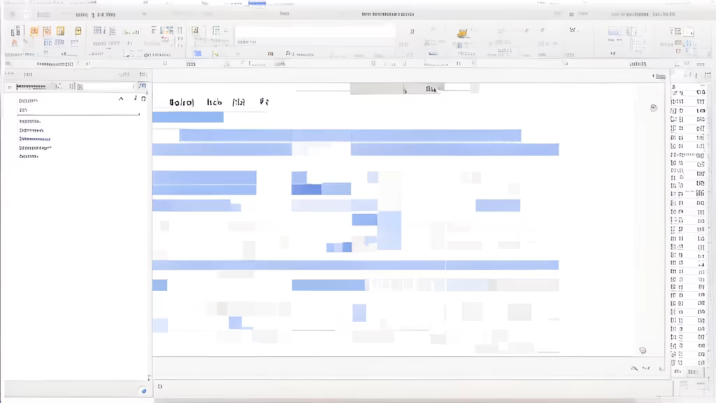
Prompt: Python, based on the data provided by the text, sequentially calls the interface and records the feedback data in a CSV file