Prompt: /imagine prompt: Outer circle: The outer circle symbolises unity and togetherness. It can be in the standard colours of the Russian flag (white, blue, red).Inner circle: Inside the outer circle is the image of the Russian flag, which occupies the central part of the logo.Upper part of the inner circle: In this part, the commemorative date \"1994-2024\" is placed to mark \"30 years of the Legislative Assembly\".Lower part of the inner circle: Here is the stylised symbol of the Legislative Assembly, which is an image of the Mariinsky Palace or another characteristic architectural element of St. Petersburg.::3 logo::3


Prompt: /imagine prompt: Outer circle: The outer circle symbolises unity and togetherness. It can be in the standard colours of the Russian flag (white, blue, red).Inner circle: Inside the outer circle is the image of the Russian flag, which occupies the central part of the logo.Upper part of the inner circle: In this part, the commemorative date \"1994-2024\" is placed to mark \"30 years of the Legislative Assembly\".Lower part of the inner circle: Here is the stylised symbol of the Legislative Assembly, which is an image of the Mariinsky Palace or another characteristic architectural element of St. Petersburg.::3 logo::3
Prompt: The simplified logo of the G20 features a clean and minimalist design, focusing on the flags of the member countries. The logo consists of a circular emblem that represents unity and collaboration. Inside the emblem, the flags of the G20 member nations are displayed in a circular arrangement, with each flag represented by a small and stylized icon. The flags are carefully positioned to create a sense of balance and symmetry, emphasizing the equal partnership among the G20 countries. Surrounding the flag icons, a thin circle is incorporated, symbolizing the continuous dialogue and exchange of ideas within the G20 community. The circle further emphasizes the inclusive nature of the organization and its commitment to global cooperation. Beneath the emblem, the text \"G20\" is written in a simple yet bold font, complementing the clean design of the logo. This minimalist approach allows the focus to be on the flags, representing the diverse nations and their collective efforts to address global challenges.


Prompt: The new logo of the G20 is dynamic and vibrant, reflecting the spirit of global collaboration and unity. It features a circular emblem with a bold and modern design. The outer circle represents the international community, symbolizing inclusivity, cooperation, and the interconnectedness of nations. Inside the circle, there are 20 small dots, each representing a member country of the G20. The colors used in the logo are rich and diverse, showcasing the diversity and cultural uniqueness of the participating nations. The primary colors used are blue, representing stability and trust, and green, symbolizing sustainability and environmental consciousness. In the center of the emblem, there is an iconic image that represents the main theme of the G20 summit. For example, it could be an abstract representation of people holding hands, emphasizing global solidarity. Alternatively, it could feature intertwined gears or puzzle pieces, symbolizing cooperation and the collective effort required to address global challenges.


Prompt: The new logo of the G20 features a combination of powerful symbols and modern design elements. The central focus of the logo is a globe, symbolizing global unity and cooperation. The globe is depicted in vibrant colors, representing the diversity and interconnectedness of the G20 member countries. Embracing the globe is a circular emblem that represents unity and harmony. It consists of intertwining arcs and lines, forming a continuous loop. This emblem signifies the collaborative efforts and continuous dialogue among the G20 nations to address global challenges. Surrounding the central emblem are twenty smaller icons, each representing one member country of the G20. These icons take the shape of various landmarks, national symbols, or elements that are unique to each country, showcasing their individual identities within the context of the G20 community. The typography used for the G20 logo is contemporary and sleek, conveying a sense of professionalism and progress. The text \"G20\" is prominently displayed beneath the emblem, with the numbers and letters gracefully intertwined.

Prompt: This logo features a large circle symbolizing unity and balance, with symmetric abstract elements inside, creating a unique display reflecting harmony; a yin-yang symbol with a abstract color contrast, and psychadelic style design, highlighting differences yet unity; and English text in a clean font that is relevant to the company/organization's vision or values.
Prompt: Create a clean and straightforward circular logo, prominently displaying two \"囍\" characters in vibrant red. Make the \"囍\" characters the central focus of the entire logo, using bold and fluid typography to ensure clarity and visibility within the circular design. Keep the background simple to accentuate the festive and auspicious symbolism of the \"囍\" characters.


Prompt: Content: Logo centered around the Chinese character \"囍\"Shape: CircularColor: Primary color is red

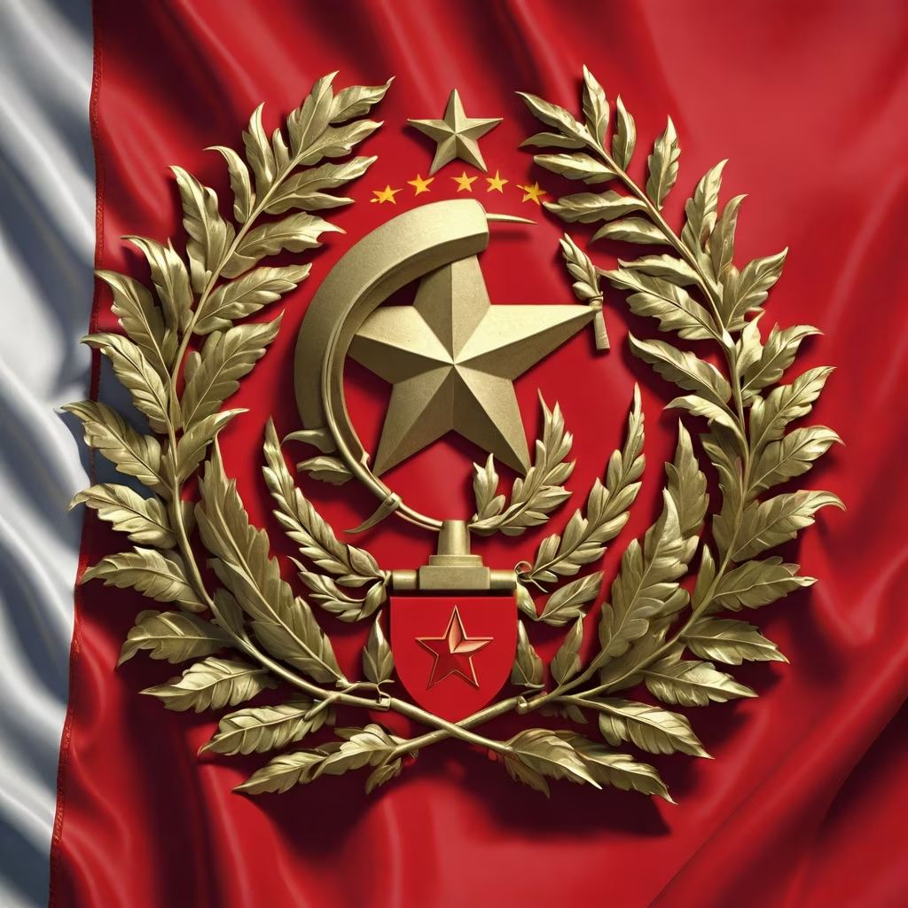
Prompt: Volgograd Republic - Flag: The design of the Volgograd Republic flag adheres to the principles of vexillology, ensuring simplicity, meaningful symbolism, and easy recognition. The flag consists of three horizontal stripes, each carefully chosen to convey specific historical and ideological significance. Red Stripe (Top): The top stripe is a bold red, evoking the traditional color associated with socialism and the working class. Red symbolizes the revolutionary spirit that led to the formation of the Volgograd Republic and the commitment to socialist principles. Black Stripe (Middle): Positioned in the middle, a striking black stripe represents the historical struggle for independence. This color signifies resilience, determination, and the challenges faced by the people of Volgograd during the tumultuous period of secession from Moscow. Golden Hammer and Sickle on Laurel Wreaths (Center): The centerpiece of the flag features a golden hammer and sickle, classic symbols of the working class and socialist ideology. They are set against laurel wreaths, symbolizing victory and honor. This emblem is a powerful representation of the triumph of the working class in Volgograd and their commitment to the principles of socialism. The design is intentionally simple and easily recognizable, even from a distance. The choice of colors and symbols is deeply rooted in the historical context of Volgograd's formation, creating a flag that resonates with the population and serves as a unifying symbol of the nation's identity. Vexillological Analysis: Simplicity: The flag adheres to the principle of simplicity, ensuring that it can be easily identified and remembered. The three horizontal stripes and central emblem are uncomplicated, making the flag effective in various contexts. Distinctive Colors: The bold use of red and black creates a strong visual contrast, enhancing visibility. These colors are not only visually striking but also carry rich historical and ideological significance, adding depth to the symbolism of the flag. Meaningful Symbolism: The inclusion of the golden hammer and sickle on laurel wreaths at the center of the flag is a powerful and meaningful representation of the nation's values and historical journey. This emblem is a legitimate embodiment of the socialist ideals and the triumph of the working class. Cohesive Design: The overall design of the flag is cohesive, with each element complementing the others to convey a unified message. The arrangement of colors and symbols creates a balanced and aesthetically pleasing composition. The Volgograd Republic flag, designed with careful consideration of vexillological principles, serves as a legitimate and powerful symbol of the nation's identity, reflecting its history, values, and commitment to socialism.

Prompt: Russia, our sacred StateRussia, our beloved countryMighty will, great glory —It’s your legacy, throughout the ages.Glory to our free HomelandCenturies-old union of sister nationsBy the folk wisdom let by the ancestorsGlory to our country! We’re proud of you!From the southern seas to the polar regionOur forests and fields spread.You are one in the world! You are one of a kind —Homeland kept by God.Glory to our free HomelandCenturies-old union of sister nationsBy the folk wisdom let by the ancestorsGlory to our country! We’re proud of you!
Style: Photographic


Prompt: This logo features a large circle symbolizing unity and balance, with symmetric abstract elements inside, creating a unique display reflecting harmony; a yin-yang symbol with a black and white color contrast, highlighting differences yet unity; and English text in a clean font that is relevant to the company/organization's vision or values.


Prompt: Volgograd Republic Flag: The flag of the Volgograd Republic is a simple design featuring a solid, bold red field. Centered on the red background is a golden hammer and sickle emblem, symbolizing the working class and socialist principles. The flag is characterized by its straightforward and easily recognizable composition, with a focus on the prominent red color and iconic emblem at its center.
Prompt: Certainly! Here's a prompt describing a fusion between the Inter Milan logo:\"Imagine an intriguing fusion—a melding of the iconic logos of Inter Milan, blending the rich heritage of both clubs into a singular, unified emblem.This fusion captures the essence of both Inter and AC Milan logos, symbolizing their rich history and tradition. Picture a new emblem that seamlessly blends the distinctive elements of each team's crest.Highlight the fusion's design—a unique emblem combining the iconic colors, shapes, and symbols of Inter and AC Milan. Incorporate the classic black and blue stripes of Inter with the red and black elements of AC Milan in a cohesive and visually striking manner.Depict the emblem's shape as a harmonious union—a balanced composition that pays homage to the rich legacies of both clubs. Perhaps, integrate symbolic elements from each logo, such as the serpent from Inter and the red cross from AC Milan, in a way that signifies unity and strength.Illustrate the fusion as a representation of unity and shared history—a powerful symbol that signifies a mutual respect and the coming together of two storied football clubs. This new emblem represents a harmonious blend of tradition, rivalry, and respect, uniting the distinct identities of Inter and AC Milan into a singular emblem of pride and strength.\"


Prompt: Draw a vertically-oriented logo in shades of deep and light blue, and rouge color, with a circular shape on top and supported by two leaves at the bottom, composed of simple geometric shapes, depicting the shape of a rose.


Prompt: Make a school logo, the school’s name is 束馆镇中心小学 It is required to bring the school name in Chinese characters and the first letter of the Chinese pinyin of the school name in capital letters.The style of the logo requires a large circle surrounding a small circle. Inside the small circle is a small sapling and a sun, which means that the small sapling will thrive under the sun. The overall color is random.


Prompt: The new G20 logo features a vibrant and dynamic design that captures the essence of global collaboration and unity. The logo is circular in shape, representing the interconnectedness and inclusivity of the G20 member nations. At the center of the logo, there is a stylized globe in varying shades of blue, symbolizing the diverse nations coming together worldwide. The globe is surrounded by a burst of colorful, intertwining lines and shapes, representing the exchange of ideas, knowledge, and economic growth among the G20 countries. Emerging from the top of the logo are three upward-pointing arrows in bold, energetic strokes, symbolizing progress, development, and cooperation among the member nations. Beneath the logo, the acronym \"G20\" is displayed in a clean and modern font, reflecting the organization's forward-thinking approach. The colors used in the logo are a harmonious blend of blue, symbolizing stability and trust, and vibrant hues representing the diversity and energy of the member countries.


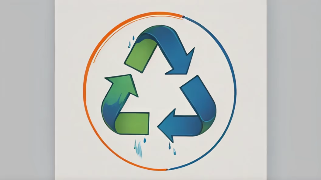
Prompt: I want a circular competition logo divided into four quadrants: one quarter is water, one quarter is nature, one quarter is renewable electricity, one quarter is recycling.
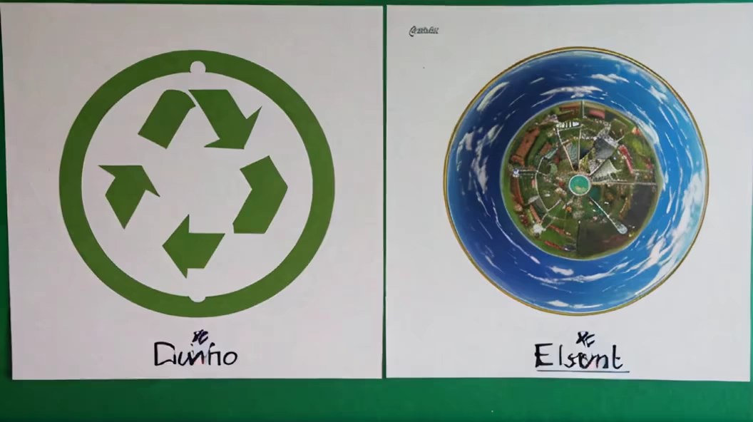
Prompt: Logo for Disabled Persons FederationAdopt a circular or other non-discriminatory shape to convey society's inclusivity and acceptance of people with disabilities.Humanizing Elements: Incorporate human silhouettes, gestures, or other friendly graphics to express warmth and understanding.Dynamic Sensation: Use smooth lines or gradient colors to depict the active participation and continuous progress of people with disabilities in society.Symbolic Graphics: Utilize symbolic elements such as puzzles or interlocking pieces to emphasize diversity and the uniqueness of each individual.Color Selection: Consider using warm and comfortable tones, avoiding overly bright or indifferent colors to create a sense of warmth.Clarity: Avoid overly complex designs, maintain simplicity to ensure the logo is easily recognizable and memorable.


Prompt: Logo for the Disabled Persons' FederationAdopt a circular or non-discriminatory shape to convey society's inclusivity and acceptance of people with disabilities.Humanizing elements: Incorporate human silhouettes, gestures, or other friendly graphics to express warmth and understanding.Dynamic feel: Use fluid lines or gradient colors to represent the active involvement and continuous progress of disabled individuals in society.Symbolic representation: Utilize symbolic graphics such as puzzles or interconnected elements to emphasize diversity and the uniqueness of each individual.Color selection: Consider using warm and comforting tones while avoiding overly harsh or indifferent colors to create a sense of warmth and approachability.Clarity and simplicity: Avoid overly complex designs to maintain simplicity, ensuring the logo is easy to recognize and remember.


Prompt: \"Create a compelling circular competition logo with distinct sections symbolizing water, renewable electricity, recycling, and nature. In the first quarter, focus on depicting water features like waterfalls or flowing rivers to convey the theme of water. The second quarter should showcase renewable electricity sources, such as solar panels or wind turbines, to represent clean energy. In the third quarter, emphasize recycling by incorporating symbols like recycling arrows or bins to convey sustainability. The fourth quarter should highlight the beauty of nature, possibly incorporating elements like trees, mountains, or wildlife. Ensure a seamless integration of these elements, maintaining a balanced and visually appealing composition. Use a harmonious color scheme that complements each theme and consider incorporating subtle transitions between the quarters to enhance the overall cohesion of the design. The final logo should communicate the essence of a competition focused on water, renewable energy, recycling, and nature, encouraging environmental consciousness and responsibility


Prompt: Alfa Riders' Inscription on Top. Incorporate the Turkish flag and a high-speed motorcycle within the circular logo, highlighting 'Alfa Riders


Prompt: The logo presents the \"Coca-Cola\" inscription using an artistic Arabic font that blends authenticity with modernity. This inscription is placed within an ornate circle inspired by traditional Arabic geometric designs. The font elegantly intertwines with the ornate patterns and sophisticated geometric shapes surrounding the inscription.The colors draw inspiration from Arab heritage, using light blue symbolizing the sky, white for purity, and gold for luxury. These colors are harmoniously integrated, providing depth and allure to the logo.The element of the \"Coca-Cola\" bottle creatively appears within the circle, featuring clear and distinctive lines with intricate details that capture the essence of the famous bottle in a simplified and beautiful manner.Small geometric shapes adorn the center of the logo, enhancing its aesthetic appeal, while striking a perfect balance between the primary inscription and the decorative elements surrounding it.This design aims to respect the Arab identity, attracting attention with a unique style that merges heritage and modernity seamlessly.


Prompt: The logo presents the \"Coca-Cola\" inscription using an artistic Arabic font that blends authenticity with modernity. This inscription is placed within an ornate circle inspired by traditional Arabic geometric designs. The font elegantly intertwines with the ornate patterns and sophisticated geometric shapes surrounding the inscription.The colors draw inspiration from Arab heritage, using light blue symbolizing the sky, white for purity, and gold for luxury. These colors are harmoniously integrated, providing depth and allure to the logo.The element of the \"Coca-Cola\" bottle creatively appears within the circle, featuring clear and distinctive lines with intricate details that capture the essence of the famous bottle in a simplified and beautiful manner.Small geometric shapes adorn the center of the logo, enhancing its aesthetic appeal, while striking a perfect balance between the primary inscription and the decorative elements surrounding it.This design aims to respect the Arab identity, attracting attention with a unique style that merges heritage and modernity seamlessly , hyperdetailed


Prompt: The logo presents the \"Coca-Cola\" inscription using an artistic Arabic font that blends authenticity with modernity. This inscription is placed within an ornate circle inspired by traditional Arabic geometric designs. The font elegantly intertwines with the ornate patterns and sophisticated geometric shapes surrounding the inscription.The colors draw inspiration from Arab heritage, using light blue symbolizing the sky, white for purity, and gold for luxury. These colors are harmoniously integrated, providing depth and allure to the logo.The element of the \"Coca-Cola\" bottle creatively appears within the circle, featuring clear and distinctive lines with intricate details that capture the essence of the famous bottle in a simplified and beautiful manner.Small geometric shapes adorn the center of the logo, enhancing its aesthetic appeal, while striking a perfect balance between the primary inscription and the decorative elements surrounding it.This design aims to respect the Arab identity, attracting attention with a unique style that merges heritage and modernity seamlessly.hyperdetailed


Prompt: Design an exquisite user logo within a perfect circular boundary, filled with a vibrant nebula cloud formation as the primary element. The nebula should feature rich and elegant gradients, with blue as the main color amongst a kaleidoscope of vivid shades. The design must embody minimalism and sophistication, with a clear silhouette of a person seamlessly integrated into the circle, representing a user profile. Emphasize the nebula's textural detail to convey a sense of organic creativity, while maintaining the gradients subtle to give the logo depth and a refined aesthetic. Ensure the white background to highlight the logo's purity and the striking colors of the nebula clouds.
Style: Digital Art


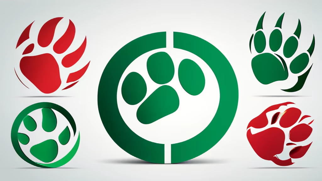
Prompt: Circular Form: Circular shape Green Bear Paw: Green paw Emerging Red Bull Head: Emerging red bull head K-line V-Formation: K-line V-shape Financial Symbolism: Financial elements Simplicity: Simplicity Balance: Balance Contrast: Contrast Modern Design: Modern design Clear Recognition: Clear and recognizable
Prompt: Generate a vibrant and dynamic circular competition logo that seamlessly integrates elements of water, nature, electricity, and garbage. Emphasize harmony and balance among these four elements, ensuring that water, nature, electricity, and garbage are visually represented in a cohesive and engaging manner within the circular composition. The design should evoke a sense of environmental awareness and sustainability. Use a color palette that reflects the vitality of nature, the flow of water, the energy of electricity, and the challenge of managing garbage responsibly. Consider incorporating relevant symbols or icons for each element to enhance clarity and convey the theme effectively. The final logo should be versatile and suitable for various applications, such as print, digital media, and merchandise


Prompt: Circular Form: Circular shape Green Bear Paw: Green paw positioned centrally within the circle Emerging Red Bull Head: Red bull head emerging from the bear paw K-line V-Formation: K-line forming a V-shape below, with the first green and the next two red Financial Symbolism: Financial elements symbolized by the K-lines and emerging bull head Simplicity: Simple yet dynamic design Balance: Balanced composition of elements Contrast: Contrast between green and red elements Modern Design: A modern and innovative design approach Clear Recognition: Clear and recognizable representation of financial dynamics



Prompt: Generate a minimalistic and remarkable logo. The logo should feature a unique abstract symbol that represents connectivity, protection, or sleek design. Use a combination of red and blue colors. The symbol should be dynamic, fluid, and convey a sense of modernity. Additionally, include the brand name in a clean sans-serif font underneath the symbol. The overall design should be memorable and suitable for a tech-savvy and stylish audience,
Negative: Smartphone,Mobile,


Prompt: Generate a minimalistic and remarkable logo. The logo should feature a unique abstract symbol that represents connectivity, protection, or sleek design. Use a combination of red and blue colors. The symbol should be dynamic, fluid, and convey a sense of modernity. Additionally, include the brand name in a clean sans-serif font underneath the symbol. The overall design should be memorable and suitable for a tech-savvy and stylish audience,
Negative: Smartphone,Mobile,Bold


Prompt: Generate a minimalistic and remarkable logo. The logo should feature a unique abstract symbol that represents connectivity, protection, or sleek design. Use a combination of red and blue colors. The symbol should be dynamic, fluid, and convey a sense of modernity. Additionally, include the brand name in a clean sans-serif font underneath the symbol. The overall design should be memorable and suitable for a tech-savvy and stylish audience,
Negative: Smartphone,Mobile,


Prompt: prompt:Shape: Create a large circle to represent the school as a whole. Text: Write the name of the school \"Shuguan Town Central Primary School\" using Chinese characters inside the large circle, and add uppercase Chinese Pinyin letters (shu guan zhen zhong xin xiao xue) below the large circle. Internal pattern: Place a small circle in the center of the large circle, and draw a small sun inside the small circle to represent light and hope. Place a small sapling under the small sun to symbolize the sapling growing vigorously under the sun. Color: The overall color can be the school’s iconic color, or you can consider using warm and friendly colors to highlight the school’s vitality and positivity. Arrangement: Make sure all elements are properly arranged so that the overall icon looks balanced and beautiful.






Prompt: Design Highlights: Color: Chose a red color scheme to emphasize passion and vitality. Shape: Opted for a shield shape, symbolizing protection, unity, and class cohesion. Number 20: Incorporated the number 20 into the shield design, highlighting the class's grade. Pattern: Added an outstretched-wing eagle inside the shield, representing strength, courage, and a spirit of endeavor.


Prompt: Design a unique and minimalist logo with the letters \"a\"and \"t\" , capturing a travel and adventure vibe. Prioritize creativity and modern design, and use a color theme of red and deep blue and white to evoke a stylish and appealing aesthetic, add a 16 inches small trolley Luggage, inside a Circle,
Negative: Realistic


Prompt: A circular LOGO, the background color can be dark blue or light pink, these colors are usually related to weddings.In the center of the circle, there is a classical clock pattern, representing time.The hands of the time clock point to a beautiful dream scenery, such as an ancient castle, a lake, or the wedding moment of a couple.The text \"Qi Meng Time\" is surrounded by elegant fonts around the periphery of the circular LOGO.


Prompt: Circular Emblem: Simple circular logo. Majestic Bull Horns: Depiction of a bull's head with large horns. Bear Paw Inclusion: Integration of a bear paw symbol. V-Shaped Reversal K-lines: Three K-lines forming a V-shape, signaling reversal. Bullish Momentum: Strong bullish trend represented by the bull icon. Bearish Sentiment: Downtrend conveyed through the bear paw. Dynamic Interaction: Depiction of the bull breaking free from the bear paw. Vibrant Bullish Reversal: Vigorous reversal emphasized by the V-shaped K-lines. Market Resilience: Symbolic representation of market strength. Contrasting Trends: Contrast between the bullish and bearish market trends.
Prompt: The computer system onboard Apollo 11, portrayed as a corporate logo, symbolizes the precision and innovation of the mission. Clean lines and symbolic elements convey a sense of technological prowess and reliability. For the logo: The design style embraces simplicity, featuring clean lines and a minimalist aesthetic. The logo incorporates symbolic elements, such as orbits and navigation arrows, subtly representing the spacecraft's mission. Volumetric Lighting: Illuminated by a focused light source, the logo exudes a sense of clarity and precision. The lighting technique highlights key elements, creating a sleek and polished appearance.


