Prompt: The simplified logo of the G20 features a clean and minimalist design, focusing on the flags of the member countries. The logo consists of a circular emblem that represents unity and collaboration. Inside the emblem, the flags of the G20 member nations are displayed in a circular arrangement, with each flag represented by a small and stylized icon. The flags are carefully positioned to create a sense of balance and symmetry, emphasizing the equal partnership among the G20 countries. Surrounding the flag icons, a thin circle is incorporated, symbolizing the continuous dialogue and exchange of ideas within the G20 community. The circle further emphasizes the inclusive nature of the organization and its commitment to global cooperation. Beneath the emblem, the text \"G20\" is written in a simple yet bold font, complementing the clean design of the logo. This minimalist approach allows the focus to be on the flags, representing the diverse nations and their collective efforts to address global challenges.


Prompt: The new logo of the G20 is dynamic and vibrant, reflecting the spirit of global collaboration and unity. It features a circular emblem with a bold and modern design. The outer circle represents the international community, symbolizing inclusivity, cooperation, and the interconnectedness of nations. Inside the circle, there are 20 small dots, each representing a member country of the G20. The colors used in the logo are rich and diverse, showcasing the diversity and cultural uniqueness of the participating nations. The primary colors used are blue, representing stability and trust, and green, symbolizing sustainability and environmental consciousness. In the center of the emblem, there is an iconic image that represents the main theme of the G20 summit. For example, it could be an abstract representation of people holding hands, emphasizing global solidarity. Alternatively, it could feature intertwined gears or puzzle pieces, symbolizing cooperation and the collective effort required to address global challenges.


Prompt: The new logo of the G20 features a combination of powerful symbols and modern design elements. The central focus of the logo is a globe, symbolizing global unity and cooperation. The globe is depicted in vibrant colors, representing the diversity and interconnectedness of the G20 member countries. Embracing the globe is a circular emblem that represents unity and harmony. It consists of intertwining arcs and lines, forming a continuous loop. This emblem signifies the collaborative efforts and continuous dialogue among the G20 nations to address global challenges. Surrounding the central emblem are twenty smaller icons, each representing one member country of the G20. These icons take the shape of various landmarks, national symbols, or elements that are unique to each country, showcasing their individual identities within the context of the G20 community. The typography used for the G20 logo is contemporary and sleek, conveying a sense of professionalism and progress. The text \"G20\" is prominently displayed beneath the emblem, with the numbers and letters gracefully intertwined.

Prompt: The new G20 logo features a vibrant and dynamic design that captures the essence of global collaboration and unity. The logo is circular in shape, representing the interconnectedness and inclusivity of the G20 member nations. At the center of the logo, there is a stylized globe in varying shades of blue, symbolizing the diverse nations coming together worldwide. The globe is surrounded by a burst of colorful, intertwining lines and shapes, representing the exchange of ideas, knowledge, and economic growth among the G20 countries. Emerging from the top of the logo are three upward-pointing arrows in bold, energetic strokes, symbolizing progress, development, and cooperation among the member nations. Beneath the logo, the acronym \"G20\" is displayed in a clean and modern font, reflecting the organization's forward-thinking approach. The colors used in the logo are a harmonious blend of blue, symbolizing stability and trust, and vibrant hues representing the diversity and energy of the member countries.


Prompt: The new logo of the G20 is dynamic and vibrant, reflecting the spirit of global collaboration and unity. It features a circular emblem with a bold and modern design. The outer circle represents the international community, symbolizing inclusivity, cooperation, and the interconnectedness of nations. Inside the circle, there are 20 small dots, each representing a member country of the G20. The colors used in the logo are rich and diverse, showcasing the diversity and cultural uniqueness of the participating nations. The primary colors used are blue, representing stability and trust, and green, symbolizing sustainability and environmental consciousness. In the center of the emblem, there is an iconic image that represents the main theme of the G20 summit. For example, it could be an abstract representation of people holding hands, emphasizing global solidarity. Alternatively, it could feature intertwined gears or puzzle pieces, symbolizing cooperation and the collective effort required to address global challenges.
Style: Tile Texture


Prompt: /imagine prompt: Outer circle: The outer circle symbolises unity and togetherness. It can be in the standard colours of the Russian flag (white, blue, red).Inner circle: Inside the outer circle is the image of the Russian flag, which occupies the central part of the logo.Upper part of the inner circle: In this part, the commemorative date \"1994-2024\" is placed to mark \"30 years of the Legislative Assembly\".Lower part of the inner circle: Here is the stylised symbol of the Legislative Assembly, which is an image of the Mariinsky Palace or another characteristic architectural element of St. Petersburg.::3 logo::3


Prompt: /imagine prompt: Outer circle: The outer circle symbolises unity and togetherness. It can be in the standard colours of the Russian flag (white, blue, red).Inner circle: Inside the outer circle is the image of the Russian flag, which occupies the central part of the logo.Upper part of the inner circle: In this part, the commemorative date \"1994-2024\" is placed to mark \"30 years of the Legislative Assembly\".Lower part of the inner circle: Here is the stylised symbol of the Legislative Assembly, which is an image of the Mariinsky Palace or another characteristic architectural element of St. Petersburg.::3 logo::3
Prompt: A news company logo. It is a circle with an earth inside. In the middle of the earth are written \"NEWS\" in four capital letters. The earth is divided into eight parts by eight lines. This logo may be used to represent the global reach and professionalism of this news company.


Prompt: Design a logo for 'GlobalFocus,' a news channel focused on international affairs and geopolitics. The logo should represent a global perspective and a direct focus on worldwide events. Consider incorporating a globe or a global element with an emphasis on a specific area to symbolize attention. Use a clean and modern design with colors that convey professionalism and global connectivity. Feel free to experiment with typography and iconography to create a logo that portrays seriousness and relevance in covering global news.


Prompt: a picture of Abraham Lincoln punching a T-Rex in the face, the T-Rex looks like it got knocked out.
Style: Origami


Prompt: The computer system onboard Apollo 11, portrayed as a corporate logo, symbolizes the precision and innovation of the mission. Clean lines and symbolic elements convey a sense of technological prowess and reliability. For the logo: The design style embraces simplicity, featuring clean lines and a minimalist aesthetic. The logo incorporates symbolic elements, such as orbits and navigation arrows, subtly representing the spacecraft's mission. Volumetric Lighting: Illuminated by a focused light source, the logo exudes a sense of clarity and precision. The lighting technique highlights key elements, creating a sleek and polished appearance.


Prompt: This logo features a large circle symbolizing unity and balance, with symmetric abstract elements inside, creating a unique display reflecting harmony; a yin-yang symbol with a black and white color contrast, highlighting differences yet unity; and English text in a clean font that is relevant to the company/organization's vision or values.


Prompt: Logo for the Disabled Persons' FederationAdopt a circular or non-discriminatory shape to convey society's inclusivity and acceptance of people with disabilities.Humanizing elements: Incorporate human silhouettes, gestures, or other friendly graphics to express warmth and understanding.Dynamic feel: Use fluid lines or gradient colors to represent the active involvement and continuous progress of disabled individuals in society.Symbolic representation: Utilize symbolic graphics such as puzzles or interconnected elements to emphasize diversity and the uniqueness of each individual.Color selection: Consider using warm and comforting tones while avoiding overly harsh or indifferent colors to create a sense of warmth and approachability.Clarity and simplicity: Avoid overly complex designs to maintain simplicity, ensuring the logo is easy to recognize and remember.


Prompt: This logo features a large circle symbolizing unity and balance, with symmetric abstract elements inside, creating a unique display reflecting harmony; a yin-yang symbol with a abstract color contrast, and psychadelic style design, highlighting differences yet unity; and English text in a clean font that is relevant to the company/organization's vision or values.
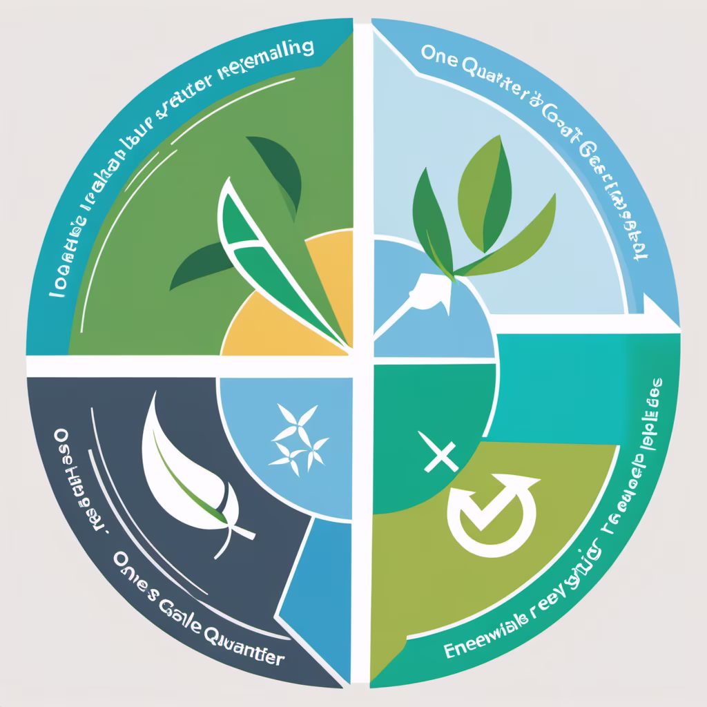
Prompt: Generate a vibrant and dynamic circular competition logo that seamlessly integrates elements of water, nature, electricity, and garbage. Emphasize harmony and balance among these four elements, ensuring that water, nature, electricity, and garbage are visually represented in a cohesive and engaging manner within the circular composition. The design should evoke a sense of environmental awareness and sustainability. Use a color palette that reflects the vitality of nature, the flow of water, the energy of electricity, and the challenge of managing garbage responsibly. Consider incorporating relevant symbols or icons for each element to enhance clarity and convey the theme effectively. The final logo should be versatile and suitable for various applications, such as print, digital media, and merchandise


Prompt: A circular competition logo divided into four equal sections. The first quarter represents water, the second quarter represents electricity, the third quarter represents nature, and the fourth quarter represents recycling.


Prompt: Create a flat vector, illustrative-style abstract concept logo design for an NGO named \"Saanchi Foundation \u0026 Charitable Trust\". Craft a circular shape with flowing, interconnected lines representing unity and collaboration. Inside the circle, incorporate various symbols such as a heart for compassion, an open hand for giving, and a globe for global impact. Use warm, earthy tones like orange, green, and brown to evoke a sense of inclusivity and nurture.


Prompt: Design a modern and minimalist logo for 'GlobalFocus,' a contemporary news channel focusing on international affairs and geopolitics. Create a logo using only typography that embodies a sense of modernity and sophistication. The font choice should reflect current design trends and evoke professionalism while maintaining simplicity and clarity. The logo should convey a sense of trust, reliability, and a global perspective. Experiment with different fonts, letter spacing, and alignments to craft a distinctive and visually appealing logo that represents GlobalFocus as a modern, authoritative source for global news.


Prompt: Minimalist vector logo designed by Ivan Chermayev in the form of a gradient circle with a fox surrounding the globe

Prompt: Generate a minimalist black and white logo for OpenAI's secure AGI mission. Utilize a single symmetrical shape, featuring a simplified Earth icon at the center. Surround the Earth with symmetrically arranged patterns, conveying OpenAI's commitment to global well-being


Prompt: logo, Graphic Part: This logo features an open book as its primary graphic element, symbolizing knowledge sharing and communication. The book is unfolded, displaying subtle ripple patterns, signifying the dissemination and expansion of knowledge. At the center of the book lies a small globe, representing global connectivity and cross-cultural exchange. Typography Part: Utilizing a modern, sleek yet distinctive font, positioned below and connected to the book graphic, displaying the platform's name. Color: The predominant color scheme is in shades of orange, symbolizing vitality, innovation, and enthusiasm, aiming to inspire user engagement and positivity. The book's pages incorporate a gradient of orange, emphasizing the visual impact.


Prompt: \"Design a logo that incorporates the elements 'G60'. Choose a modern and clean font to convey a sense of professionalism and contemporary style. Use colors that align with the brand image, either by coordinating the colors of 'G' and '60' or by selecting a prominent color. Craft a unique shape by seamlessly integrating the letter 'G' and the number '60', or consider adding simple graphic elements around 'G' and '60' for added depth. Ensure the use of clear and simple lines and patterns for visibility across various sizes and media. Prioritize adaptability by making the logo distinct and visible on different backgrounds. Avoid overly complex designs to ensure optimal performance in diverse applications. Conduct testing and seek feedback to refine the design, ensuring it effectively communicates the brand's identity and image.\"


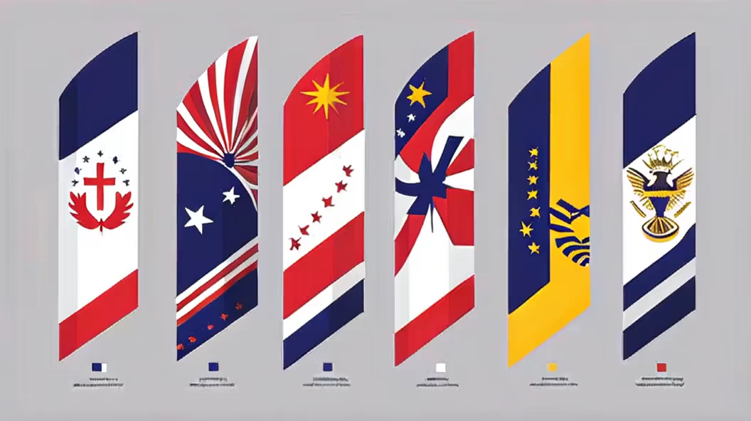
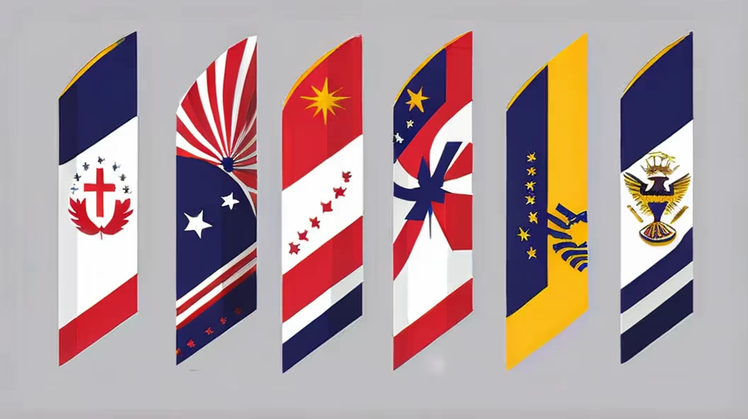
Prompt: Generate a minimalistic logo featuring a waving flag, with distinct front and back sides, each side displaying a different color. Focus on simplicity, clean lines, and a balanced composition. Choose contrasting colors for each side of the flag to create visual interest. Ensure that the design is straightforward yet effective. Provide a brief description of the symbolism or significance behind the choice of colors for each side of the flag to convey a cohesive and meaningful representation.
Style: Digital Art
Prompt: Create a contemporary and minimalist logo for 'GlobalFocus,' a news platform focusing on international affairs and geopolitics. The logo should feature modern typography in shades of blue, white, and grey. Use clean lines and sleek design elements to convey a sense of sophistication and modernity. Incorporate these colors thoughtfully to represent trustworthiness, global perspective, and professionalism. Ensure the logo reflects a modern approach to delivering in-depth global news while maintaining a visually appealing and easily recognizable design.


Prompt: simplistic, 2D logo for a political party, centre left on the political spectrum which is progressive


Prompt: Logo for Disabled Persons FederationAdopt a circular or other non-discriminatory shape to convey society's inclusivity and acceptance of people with disabilities.Humanizing Elements: Incorporate human silhouettes, gestures, or other friendly graphics to express warmth and understanding.Dynamic Sensation: Use smooth lines or gradient colors to depict the active participation and continuous progress of people with disabilities in society.Symbolic Graphics: Utilize symbolic elements such as puzzles or interlocking pieces to emphasize diversity and the uniqueness of each individual.Color Selection: Consider using warm and comfortable tones, avoiding overly bright or indifferent colors to create a sense of warmth.Clarity: Avoid overly complex designs, maintain simplicity to ensure the logo is easily recognizable and memorable.


Prompt: a minimalist style, emphasizing the theme of \"World Wonders.\" At the center, a simplified Earth icon stands out, highlighting the global nature of wonders and diversity. The smooth lines of the Earth icon represent the flow and connection of information. Around the Earth icon, curved lines incorporate some mysterious elements such as symbols or textures, showcasing the colorful and diverse experiences and stories of wonders worldwide. These elements both emphasize the uniqueness of different regions globally and maintain simplicity and cohesion. In terms of font choice, a modern and clear font is recommended to ensure that the text \"World Wonders\" is legible and harmonizes with the overall design style. For color palette, it is suggested to use deep blue or deep purple as the main tones, symbolizing depth, mystery, and captivating sensations while also coordinating with the natural tones of the Earth. Overall, this logo, with its clean lines and graphics, conveys the theme of wonders and worldwide exploration while maintaining clarity and recognizability.
Prompt: \"Create a compelling circular competition logo with distinct sections symbolizing water, renewable electricity, recycling, and nature. In the first quarter, focus on depicting water features like waterfalls or flowing rivers to convey the theme of water. The second quarter should showcase renewable electricity sources, such as solar panels or wind turbines, to represent clean energy. In the third quarter, emphasize recycling by incorporating symbols like recycling arrows or bins to convey sustainability. The fourth quarter should highlight the beauty of nature, possibly incorporating elements like trees, mountains, or wildlife. Ensure a seamless integration of these elements, maintaining a balanced and visually appealing composition. Use a harmonious color scheme that complements each theme and consider incorporating subtle transitions between the quarters to enhance the overall cohesion of the design. The final logo should communicate the essence of a competition focused on water, renewable energy, recycling, and nature, encouraging environmental consciousness and responsibility


Prompt: logo Graphic Part:This logo features an open book as its primary graphic element, symbolizing knowledge sharing and communication. The book is unfolded, displaying subtle ripple patterns, signifying the dissemination and expansion of knowledge. At the center of the book lies a small globe, representing global connectivity and cross-cultural exchange.Typography Part:Utilizing a modern, sleek yet distinctive font, positioned below and connected to the book graphic, displaying the platform's name.Color:The predominant color scheme is in shades of orange, symbolizing vitality, innovation, and enthusiasm, aiming to inspire user engagement and positivity. The book's pages incorporate a gradient of orange, emphasizing the visual impact


Prompt: logo Graphic Part:This logo features an open book as its primary graphic element, symbolizing knowledge sharing and communication. The book is unfolded, displaying subtle ripple patterns, signifying the dissemination and expansion of knowledge. At the center of the book lies a small globe, representing global connectivity and cross-cultural exchange.Typography Part:Utilizing a modern, sleek yet distinctive font, positioned below and connected to the book graphic, displaying the platform's name.Color:The predominant color scheme is in shades of orange, symbolizing vitality, innovation, and enthusiasm, aiming to inspire user engagement and positivity. The book's pages incorporate a gradient of orange, emphasizing the visual impact


Prompt: A circular competition logo divided into three equal parts, the first third represents water, the second third represents electricity, and the third third represents garbage.


Prompt: The Zen-inspired variation of the SereniSonics logo features a simple circle or enso at its core. From this central symbol, gentle sound waves emanate, symbolizing the quiet power of sound. The design embodies the Zen philosophy, promoting a sense of balance and tranquility. The combination of minimalistic aesthetics and profound symbolism creates a logo that resonates with a peaceful aura.logo design,vector design


Prompt: Craft a modern and minimalist logo for 'GlobalFocus,' a contemporary news outlet focusing on international affairs and geopolitics. The logo should embody current design trends and carry elements predominantly in shades of blue, white, and grey. Ensure the design exudes modernity and sophistication, drawing inspiration from the sleek and iconic logos of leading news networks like CNN or FOX. Incorporate a modern font that exudes professionalism and simplicity, evoking trust and reliability. Utilize clean lines and subtle details, such as shadowing effects in shades of grey, to add depth and visual interest to the logo. Create a visually striking and memorable emblem that encapsulates GlobalFocus' commitment to delivering comprehensive and up-to-date global news coverage.


Prompt: circular competition logo divided into four quadrants: one quarter is water, one quarter is nature, one quarter is renewable electricity, one quarter is garbage and recycling.


Prompt: circular competition logo divided into four quadrants: one quarter is water, one quarter is nature, one quarter is renewable electricity, one quarter is garbage and recycling


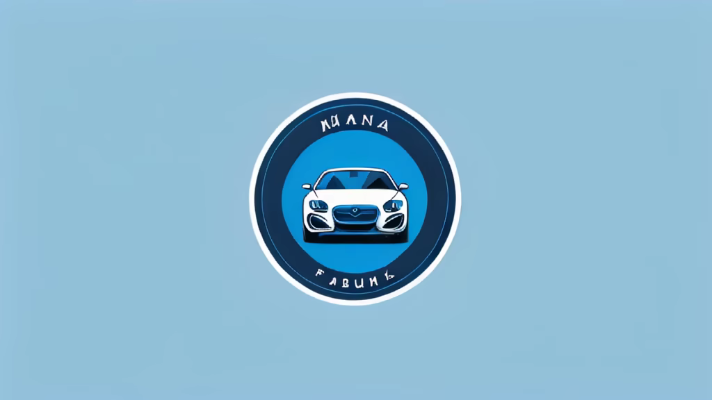
Prompt: A brand LOGO that is simple, with car elements, mainly blue, and combined with simple graphics. The LOGO is preferably round.

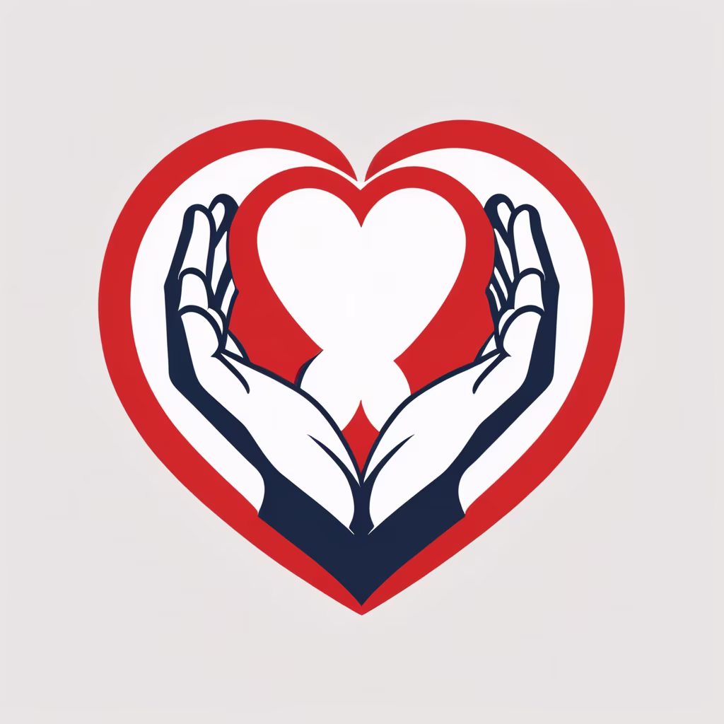
Prompt: simplistic 2d logo for a political party with a red heart in the middle with a white handshake splitting it

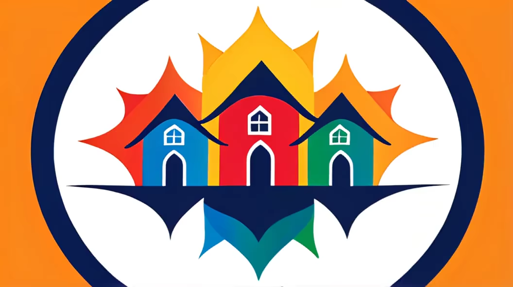
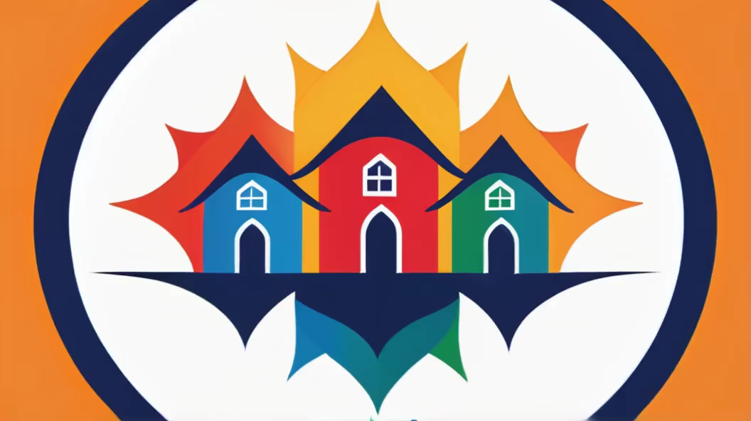
Prompt: design a logo that features interconnected houses representing diverse cultures, forming a harmonious stage. Incorporating vibrant colors and diverse symbols can visually convey the essence of GharSa's mission to unite cultures and showcase their stories.


Prompt: Explore the fusion of ancient traditions and cutting-edge technology during the Chinese New Year celebrations in the auspicious Year of the Dragon, where digital innovations illuminate the rich cultural tapestry with virtual dragon parades and interactive festivities.
Style: Digital Art


Prompt: Create a psychedelic gradient logo with a minimalist representation of the yin and yang symbol within a circular shape, embodying the essence of body and soul.


Prompt: logo incorporates all elements seamlessly. A tranquil landscape, represented by a mountain or tree, is embraced by gentle sound waves, forming a perfect harmony. The Zen circle serves as the anchor, radiating a sense of stillness and balance. The overall composition reflects the brand's commitment to capturing the essence of silence through thoughtfully integrated design elements. ,logo design,vector design,


Prompt: Design a modern and minimalist logo for 'GlobalFocus,' a contemporary news outlet focused on international affairs and geopolitics. Create a logo using only typography to convey a sense of modernity and professionalism. Utilize shades of blue, white, and grey as the primary color scheme to evoke trust, sophistication, and a global perspective. Choose a sleek and contemporary font that embodies the essence of the channel, reflecting its dedication to providing cutting-edge and insightful global news coverage. The logo should exhibit a clean, sophisticated, and current aesthetic, aligning with the trends in modern design while maintaining simplicity and clarity.


Prompt: A logo with dark background related with the geography that has minimalistic globe in the centre and minimalistic stars around the globe


Prompt: Craft a clean and simple logo for an AI-focused company, showcasing a symmetrical design reminiscent of six rotating petals. This minimalist approach echoes the mission of creating a secure AGI for the well-being of humanity

