Prompt: A news company logo. It is a circle with an earth inside. In the middle of the earth are written \"NEWS\" in four capital letters. The earth is divided into eight parts by eight lines. This logo may be used to represent the global reach and professionalism of this news company.


Prompt: A logo with dark background related with the geography that has minimalistic globe in the centre and minimalistic stars around the globe


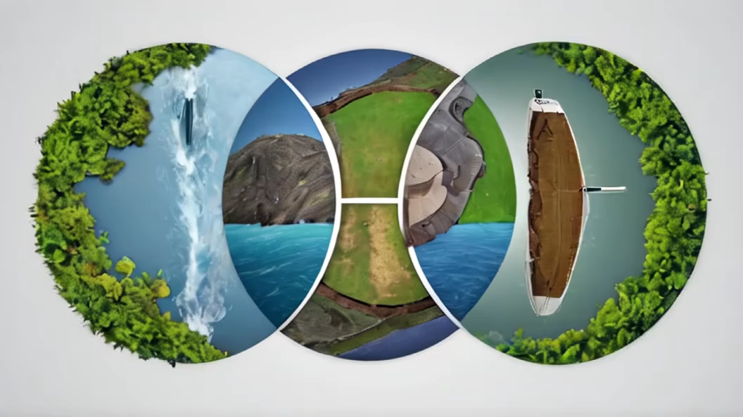
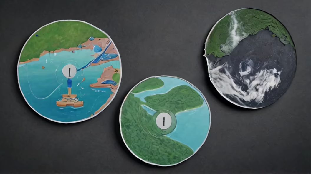
Prompt: A circular competition logo divided into four equal sections. The first quarter represents water, the second quarter represents electricity, the third quarter represents nature, and the fourth quarter represents recycling.


Prompt: logo, Graphic Part: This logo features an open book as its primary graphic element, symbolizing knowledge sharing and communication. The book is unfolded, displaying subtle ripple patterns, signifying the dissemination and expansion of knowledge. At the center of the book lies a small globe, representing global connectivity and cross-cultural exchange. Typography Part: Utilizing a modern, sleek yet distinctive font, positioned below and connected to the book graphic, displaying the platform's name. Color: The predominant color scheme is in shades of orange, symbolizing vitality, innovation, and enthusiasm, aiming to inspire user engagement and positivity. The book's pages incorporate a gradient of orange, emphasizing the visual impact.


Prompt: circular competition logo divided into four quadrants: one quarter is water, one quarter is nature, one quarter is renewable electricity, one quarter is garbage and recycling



Prompt: This logo features a large circle symbolizing unity and balance, with symmetric abstract elements inside, creating a unique display reflecting harmony; a yin-yang symbol with a black and white color contrast, highlighting differences yet unity; and English text in a clean font that is relevant to the company/organization's vision or values.


Prompt: A logo that is circular in shape and based on the Chinese character '肉' (meat) that shows the character clearly and incorporates the images of a pig, a cow, and a sheep on the character


Prompt: logo Graphic Part:This logo features an open book as its primary graphic element, symbolizing knowledge sharing and communication. The book is unfolded, displaying subtle ripple patterns, signifying the dissemination and expansion of knowledge. At the center of the book lies a small globe, representing global connectivity and cross-cultural exchange.Typography Part:Utilizing a modern, sleek yet distinctive font, positioned below and connected to the book graphic, displaying the platform's name.Color:The predominant color scheme is in shades of orange, symbolizing vitality, innovation, and enthusiasm, aiming to inspire user engagement and positivity. The book's pages incorporate a gradient of orange, emphasizing the visual impact

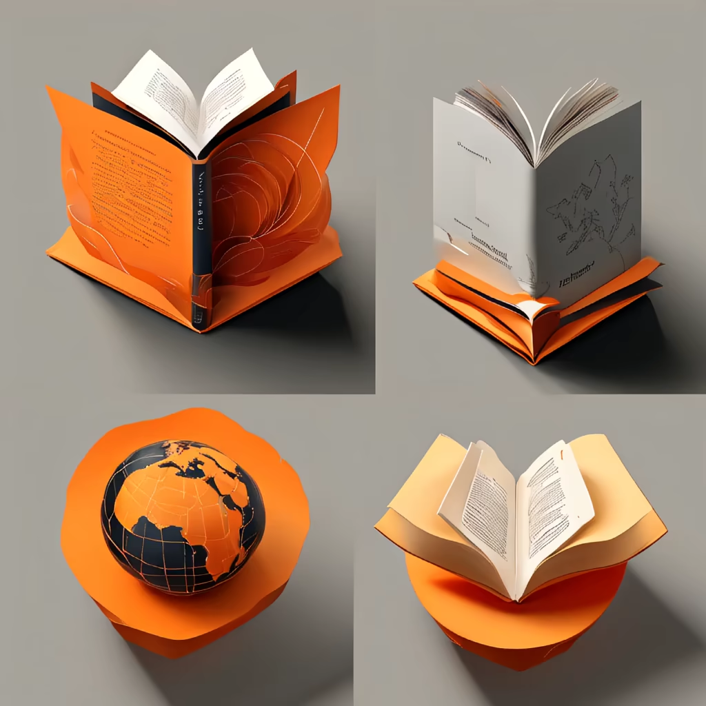


Prompt: logo Graphic Part:This logo features an open book as its primary graphic element, symbolizing knowledge sharing and communication. The book is unfolded, displaying subtle ripple patterns, signifying the dissemination and expansion of knowledge. At the center of the book lies a small globe, representing global connectivity and cross-cultural exchange.Typography Part:Utilizing a modern, sleek yet distinctive font, positioned below and connected to the book graphic, displaying the platform's name.Color:The predominant color scheme is in shades of orange, symbolizing vitality, innovation, and enthusiasm, aiming to inspire user engagement and positivity. The book's pages incorporate a gradient of orange, emphasizing the visual impact


Prompt: This logo features a large circle symbolizing unity and balance, with symmetric abstract elements inside, creating a unique display reflecting harmony; a yin-yang symbol with a abstract color contrast, and psychadelic style design, highlighting differences yet unity; and English text in a clean font that is relevant to the company/organization's vision or values.
Prompt: circular competition logo divided into four quadrants: one quarter is water, one quarter is nature, one quarter is renewable electricity, one quarter is garbage and recycling.


Prompt: The simplified logo of the G20 features a clean and minimalist design, focusing on the flags of the member countries. The logo consists of a circular emblem that represents unity and collaboration. Inside the emblem, the flags of the G20 member nations are displayed in a circular arrangement, with each flag represented by a small and stylized icon. The flags are carefully positioned to create a sense of balance and symmetry, emphasizing the equal partnership among the G20 countries. Surrounding the flag icons, a thin circle is incorporated, symbolizing the continuous dialogue and exchange of ideas within the G20 community. The circle further emphasizes the inclusive nature of the organization and its commitment to global cooperation. Beneath the emblem, the text \"G20\" is written in a simple yet bold font, complementing the clean design of the logo. This minimalist approach allows the focus to be on the flags, representing the diverse nations and their collective efforts to address global challenges.


Prompt: The new logo of the G20 is dynamic and vibrant, reflecting the spirit of global collaboration and unity. It features a circular emblem with a bold and modern design. The outer circle represents the international community, symbolizing inclusivity, cooperation, and the interconnectedness of nations. Inside the circle, there are 20 small dots, each representing a member country of the G20. The colors used in the logo are rich and diverse, showcasing the diversity and cultural uniqueness of the participating nations. The primary colors used are blue, representing stability and trust, and green, symbolizing sustainability and environmental consciousness. In the center of the emblem, there is an iconic image that represents the main theme of the G20 summit. For example, it could be an abstract representation of people holding hands, emphasizing global solidarity. Alternatively, it could feature intertwined gears or puzzle pieces, symbolizing cooperation and the collective effort required to address global challenges.


Prompt: Design a logo for 'GlobalFocus,' a news channel focused on international affairs and geopolitics. The logo should represent a global perspective and a direct focus on worldwide events. Consider incorporating a globe or a global element with an emphasis on a specific area to symbolize attention. Use a clean and modern design with colors that convey professionalism and global connectivity. Feel free to experiment with typography and iconography to create a logo that portrays seriousness and relevance in covering global news.


Prompt: a creative and very simple logo of the tree of life on top of a globe with the roots going into the continents like squiggly lines


Prompt: A circular competition logo divided into three equal parts, the first third represents water, the second third represents electricity, and the third third represents garbage.


Prompt: a minimalist style, emphasizing the theme of \"World Wonders.\" At the center, a simplified Earth icon stands out, highlighting the global nature of wonders and diversity. The smooth lines of the Earth icon represent the flow and connection of information. Around the Earth icon, curved lines incorporate some mysterious elements such as symbols or textures, showcasing the colorful and diverse experiences and stories of wonders worldwide. These elements both emphasize the uniqueness of different regions globally and maintain simplicity and cohesion. In terms of font choice, a modern and clear font is recommended to ensure that the text \"World Wonders\" is legible and harmonizes with the overall design style. For color palette, it is suggested to use deep blue or deep purple as the main tones, symbolizing depth, mystery, and captivating sensations while also coordinating with the natural tones of the Earth. Overall, this logo, with its clean lines and graphics, conveys the theme of wonders and worldwide exploration while maintaining clarity and recognizability.


Prompt: Minimalist vector logo designed by Ivan Chermayev in the form of a gradient circle with a fox surrounding the globe

Prompt: I want a circular competition logo divided into four quadrants: the water section, the nature section, the renewable electricity section, the garbage and recycling section
Prompt: Minimalist vector logo designed by Ivan Chermayev in the form of a gradient circle with a fox surrounding the earth
Prompt: Minimalist vector logo designed by Ivan Chermayev in the form of a gradient circle with a fox surrounding the earth


Prompt: Content: Logo centered around the Chinese character \"囍\"Shape: CircularColor: Primary color is red

Prompt: The new logo of the G20 features a combination of powerful symbols and modern design elements. The central focus of the logo is a globe, symbolizing global unity and cooperation. The globe is depicted in vibrant colors, representing the diversity and interconnectedness of the G20 member countries. Embracing the globe is a circular emblem that represents unity and harmony. It consists of intertwining arcs and lines, forming a continuous loop. This emblem signifies the collaborative efforts and continuous dialogue among the G20 nations to address global challenges. Surrounding the central emblem are twenty smaller icons, each representing one member country of the G20. These icons take the shape of various landmarks, national symbols, or elements that are unique to each country, showcasing their individual identities within the context of the G20 community. The typography used for the G20 logo is contemporary and sleek, conveying a sense of professionalism and progress. The text \"G20\" is prominently displayed beneath the emblem, with the numbers and letters gracefully intertwined.

Prompt: Create a logo with a globe surrounded by tire tracks, emphasizing a global and dynamic approach.




Prompt: WonderSphere's logo is a harmonious blend of a subtle Earth depiction, mysterious shadows, and warm colors, creating a sense of awe and anticipation. The simplified telescope icon within a circular design symbolizes the channel's commitment to revealing hidden marvels, while modern fonts and subtle textures enhance the overall sophistication. In essence, the logo acts as a visual beacon, inviting viewers on a journey of global exploration and extraordinary wonders.


Prompt: WonderSphere's logo is a harmonious blend of a subtle Earth depiction, mysterious shadows, and warm colors, creating a sense of awe and anticipation. The simplified telescope icon within a circular design symbolizes the channel's commitment to revealing hidden marvels, while modern fonts and subtle textures enhance the overall sophistication. In essence, the logo acts as a visual beacon, inviting viewers on a journey of global exploration and extraordinary wonders.


Prompt: picture of circular competition logo divided into four quadrants: one quarter is water, one quarter is nature, one quarter is renewable electricity, one quarter is garbage


Prompt: The new G20 logo features a vibrant and dynamic design that captures the essence of global collaboration and unity. The logo is circular in shape, representing the interconnectedness and inclusivity of the G20 member nations. At the center of the logo, there is a stylized globe in varying shades of blue, symbolizing the diverse nations coming together worldwide. The globe is surrounded by a burst of colorful, intertwining lines and shapes, representing the exchange of ideas, knowledge, and economic growth among the G20 countries. Emerging from the top of the logo are three upward-pointing arrows in bold, energetic strokes, symbolizing progress, development, and cooperation among the member nations. Beneath the logo, the acronym \"G20\" is displayed in a clean and modern font, reflecting the organization's forward-thinking approach. The colors used in the logo are a harmonious blend of blue, symbolizing stability and trust, and vibrant hues representing the diversity and energy of the member countries.


Prompt: circular competition logo divided into four sections: the water section, the nature section with some palm trees, the renewable electricity section, the garbage and recycling section.


Prompt: This icon adopts a green Earth shape, representing environmental protection and sustainable utilization of Earth's resources. The outline of the Earth is depicted very succinctly to highlight the importance and memorable nature of the theme. At the bottom of the Earth, there is a continuous arrow shape that passes through the interior of the Earth, extends to the exterior, and then returns to the Earth, forming an infinite circular pattern. This arrow represents the concept of sustainable development, which means that through the rational use of resources and the adoption of sustainable practices, we can achieve sustained growth and progress


Prompt: A modern logo design, image, the logo should include the image of a virus, cybersecurity theme, minimaliste, round logo, solid background color, lots of details




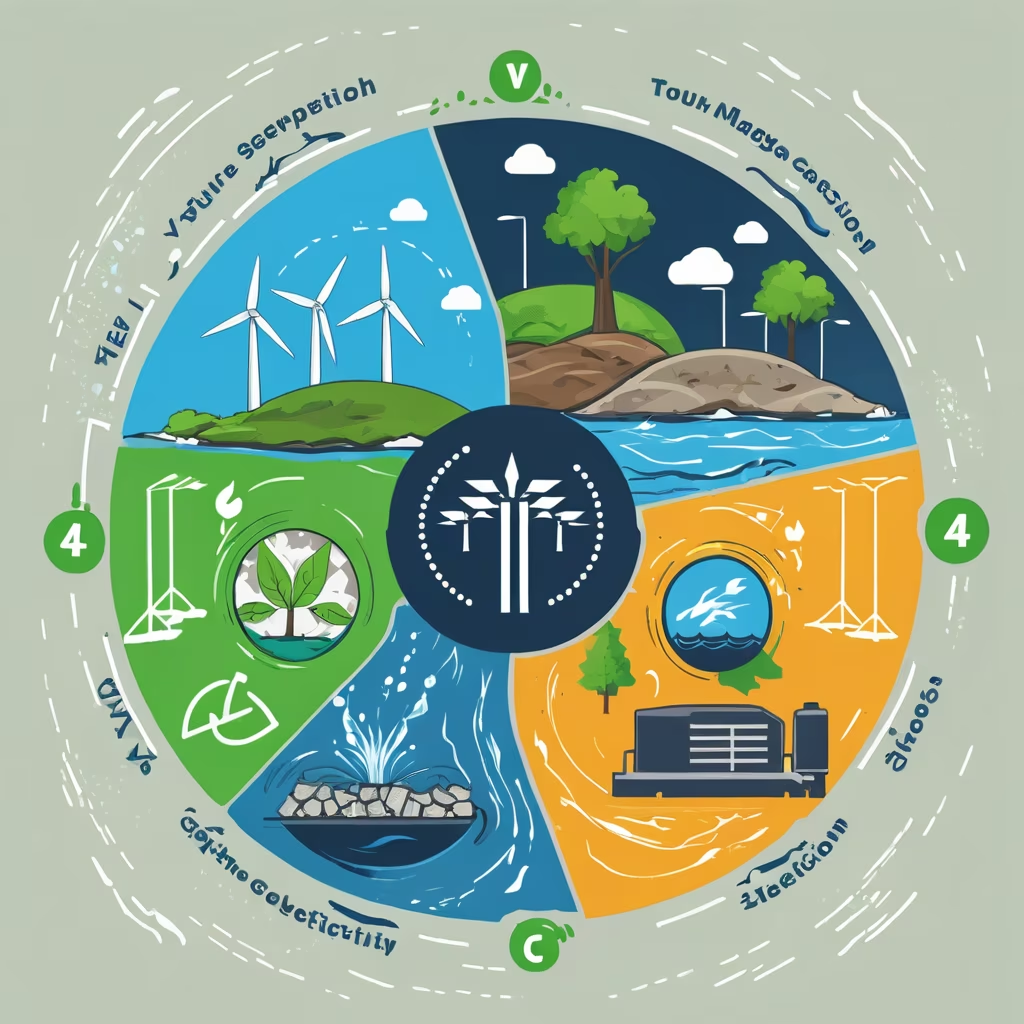
Prompt: circular competition logo divided into four sections: the water section, the nature section, the electricity section, and the garbage section


Prompt: A circular competition logo divided equally into four sections: the water section, the electricity section, and the garbage section


Prompt: A circular competition logo divided equally into four sections: the water section, the electricity section, and the garbage section
