Prompt: The Disabled Persons' Federation logo adopts a circular or other non-discriminatory shape to convey society's inclusiveness and acceptance of people with disabilities.Humanizing elements: It can incorporate human silhouettes, gestures, or other friendly graphics to express warmth and understanding.


Prompt: Disabled Persons Federation LogoAdopt a circular or other non-discriminatory shape to convey society's inclusivity and acceptance of people with disabilities.Humanizing elements: Combine human silhouettes, gestures, or other friendly graphics to express warmth and understanding.Dynamic feel: Use smooth lines or gradient colors to depict the active participation and continuous progress of disabled individuals in society.Symbolic graphics: Incorporate symbolic graphics such as puzzles or interconnected elements to emphasize diversity and the uniqueness of each individual.Color selection: Consider using warm and comfortable tones, avoiding overly vibrant or indifferent colors to create a sense of warmth.Simplicity: Avoid overly complex designs, maintain simplicity to ensure the logo is easily recognizable and memorable.


Prompt: Logo for Disabled Persons FederationAdopt a circular or other non-discriminatory shape to convey society's inclusivity and acceptance of people with disabilities.Humanizing Elements: Incorporate human silhouettes, gestures, or other friendly graphics to express warmth and understanding.Dynamic Sensation: Use smooth lines or gradient colors to depict the active participation and continuous progress of people with disabilities in society.Symbolic Graphics: Utilize symbolic elements such as puzzles or interlocking pieces to emphasize diversity and the uniqueness of each individual.Color Selection: Consider using warm and comfortable tones, avoiding overly bright or indifferent colors to create a sense of warmth.Clarity: Avoid overly complex designs, maintain simplicity to ensure the logo is easily recognizable and memorable.


Prompt: Logo for the Disabled Persons' FederationAdopt a circular or non-discriminatory shape to convey society's inclusivity and acceptance of people with disabilities.Humanizing elements: Incorporate human silhouettes, gestures, or other friendly graphics to express warmth and understanding.Dynamic feel: Use fluid lines or gradient colors to represent the active involvement and continuous progress of disabled individuals in society.Symbolic representation: Utilize symbolic graphics such as puzzles or interconnected elements to emphasize diversity and the uniqueness of each individual.Color selection: Consider using warm and comforting tones while avoiding overly harsh or indifferent colors to create a sense of warmth and approachability.Clarity and simplicity: Avoid overly complex designs to maintain simplicity, ensuring the logo is easy to recognize and remember.


Prompt: Using a circular or other non-discriminatory shape to convey society's inclusivity and acceptance of people with disabilities.Humanizing elements: Combining human silhouettes, gestures, or other friendly graphics to express warmth and understanding.Using the outline of people holding hands to form a united circle, while using warm tones to convey care and support.Individual graphic for the Disabled Persons' Federation logo.


Prompt: The new logo of the G20 features a combination of powerful symbols and modern design elements. The central focus of the logo is a globe, symbolizing global unity and cooperation. The globe is depicted in vibrant colors, representing the diversity and interconnectedness of the G20 member countries. Embracing the globe is a circular emblem that represents unity and harmony. It consists of intertwining arcs and lines, forming a continuous loop. This emblem signifies the collaborative efforts and continuous dialogue among the G20 nations to address global challenges. Surrounding the central emblem are twenty smaller icons, each representing one member country of the G20. These icons take the shape of various landmarks, national symbols, or elements that are unique to each country, showcasing their individual identities within the context of the G20 community. The typography used for the G20 logo is contemporary and sleek, conveying a sense of professionalism and progress. The text \"G20\" is prominently displayed beneath the emblem, with the numbers and letters gracefully intertwined.

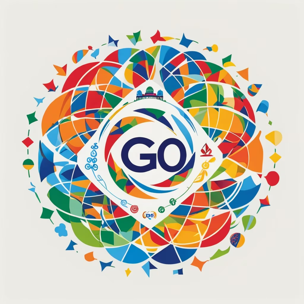
Prompt: The new logo of the G20 is dynamic and vibrant, reflecting the spirit of global collaboration and unity. It features a circular emblem with a bold and modern design. The outer circle represents the international community, symbolizing inclusivity, cooperation, and the interconnectedness of nations. Inside the circle, there are 20 small dots, each representing a member country of the G20. The colors used in the logo are rich and diverse, showcasing the diversity and cultural uniqueness of the participating nations. The primary colors used are blue, representing stability and trust, and green, symbolizing sustainability and environmental consciousness. In the center of the emblem, there is an iconic image that represents the main theme of the G20 summit. For example, it could be an abstract representation of people holding hands, emphasizing global solidarity. Alternatively, it could feature intertwined gears or puzzle pieces, symbolizing cooperation and the collective effort required to address global challenges.


Prompt: Logo of GharSa. GharSa is all about connecting people through the rich diversity of Indian cultures.


Prompt: The new G20 logo features a vibrant and dynamic design that captures the essence of global collaboration and unity. The logo is circular in shape, representing the interconnectedness and inclusivity of the G20 member nations. At the center of the logo, there is a stylized globe in varying shades of blue, symbolizing the diverse nations coming together worldwide. The globe is surrounded by a burst of colorful, intertwining lines and shapes, representing the exchange of ideas, knowledge, and economic growth among the G20 countries. Emerging from the top of the logo are three upward-pointing arrows in bold, energetic strokes, symbolizing progress, development, and cooperation among the member nations. Beneath the logo, the acronym \"G20\" is displayed in a clean and modern font, reflecting the organization's forward-thinking approach. The colors used in the logo are a harmonious blend of blue, symbolizing stability and trust, and vibrant hues representing the diversity and energy of the member countries.


Prompt: Make the sketches of three versions of the woman pictogram, three versions of the man pictogram, three versions of the person sitting sideways.


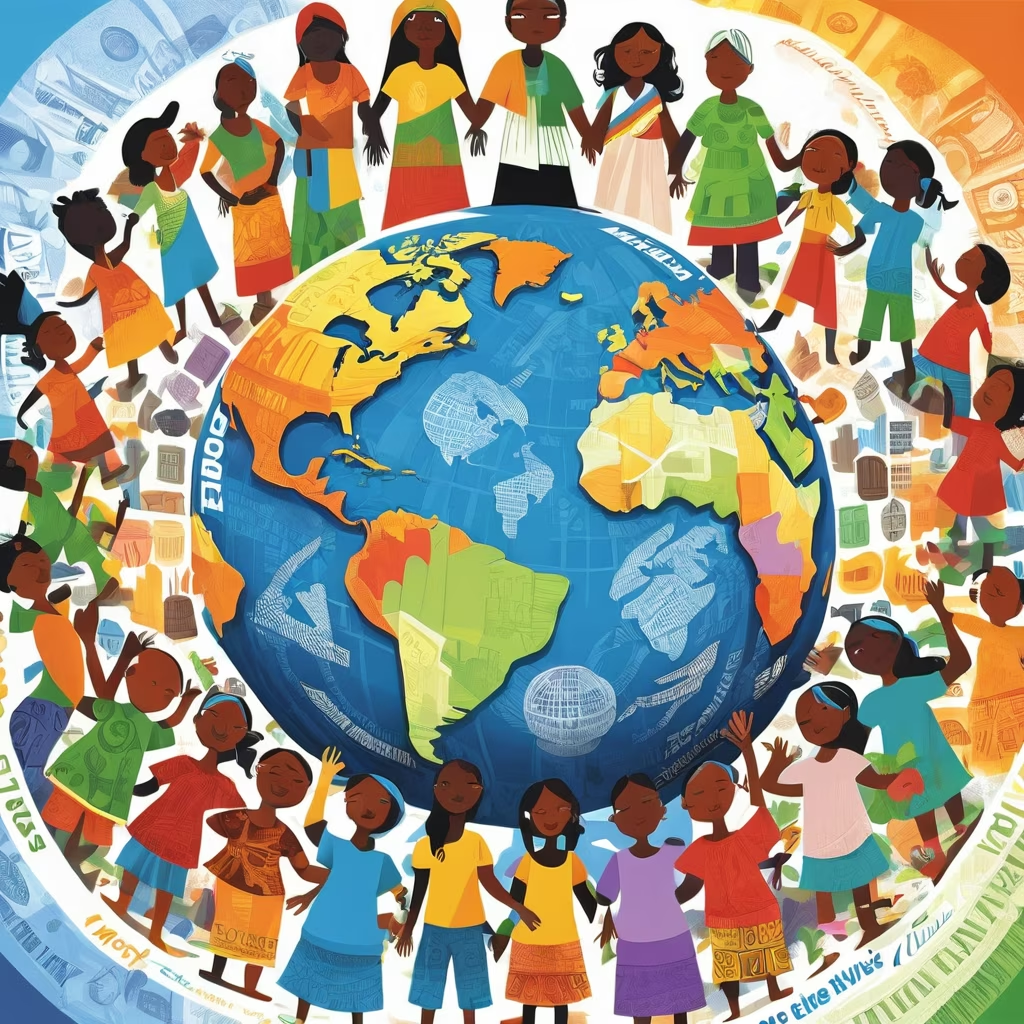
Prompt: Create an image representing global unity and progress towards reducing wealth inequality. The artwork should embody the values of equality, global cooperation, diversity, and inclusive efforts. Highlight the notion of collective action, fair trade, equitable resource distribution, sustainable development, and social justice. The visual should reflect a world where different cultures come together, standing in solidarity and collaboration to address and bridge the wealth gap.





Prompt: The logo should be both modern and professional, highlighting the field of electricity while maintaining a clean and distinct aesthetic. Elements such as stylized electrical symbols, energy-related patterns and colors that inspire confidence could be considered.


Prompt: logo da ONU - Organização das Nações Espaciais. A logo deve ser futurista e em tons de azul.




Prompt: kidney care logo, https://mail.google.com/mail/u/0?ui=2\u0026ik=a5ae9dad3f\u0026attid=0.1\u0026permmsgid=msg-f:1785317417757298346\u0026th=18c6b8bb80bdceaa\u0026view=fimg\u0026fur=ip\u0026sz=s0-l75-ft\u0026attbid=ANGjdJ-7tDUOZ-Ips0jfWGhxj5UWEPvhyEGLu7mqQnWH0I1XuXK1jJuOKQycUS44KVc5iFMosRAfoEZV9QWDPeW7iQjLB7XYNy9Fw4DsKR4MSedhVvRfhHdIH2kAj5M\u0026disp=emb\u0026realattid=ddb8d038d5d8a17b_0.1.1
Prompt: Make a school logo, the school’s name is 束馆镇中心小学 It is required to bring the school name in Chinese characters and the first letter of the Chinese pinyin of the school name in capital letters.The style of the logo requires a large circle surrounding a small circle. Inside the small circle is a small sapling and a sun, which means that the small sapling will thrive under the sun. The overall color is random.




Prompt: Certainly! Here's a prompt describing a fusion between the Inter Milan logo:\"Imagine an intriguing fusion—a melding of the iconic logos of Inter Milan, blending the rich heritage of both clubs into a singular, unified emblem.This fusion captures the essence of both Inter and AC Milan logos, symbolizing their rich history and tradition. Picture a new emblem that seamlessly blends the distinctive elements of each team's crest.Highlight the fusion's design—a unique emblem combining the iconic colors, shapes, and symbols of Inter and AC Milan. Incorporate the classic black and blue stripes of Inter with the red and black elements of AC Milan in a cohesive and visually striking manner.Depict the emblem's shape as a harmonious union—a balanced composition that pays homage to the rich legacies of both clubs. Perhaps, integrate symbolic elements from each logo, such as the serpent from Inter and the red cross from AC Milan, in a way that signifies unity and strength.Illustrate the fusion as a representation of unity and shared history—a powerful symbol that signifies a mutual respect and the coming together of two storied football clubs. This new emblem represents a harmonious blend of tradition, rivalry, and respect, uniting the distinct identities of Inter and AC Milan into a singular emblem of pride and strength.\"


Prompt: design a logo that shows people finding community not at home or work without any text or words
Prompt: Corporate culture can form a centripetal force among employees, making it easier for employees to form a sense of identity and belonging to the company and team.


Prompt: On crowded subways, some young passengers seem relatively indifferent to the seating needs of the elderly, the weak, the disabled and pregnant women. Even if elderly passengers or those in poor physical condition sometimes stand nearby, they fail to attract the attention of young people sitting in their seats.


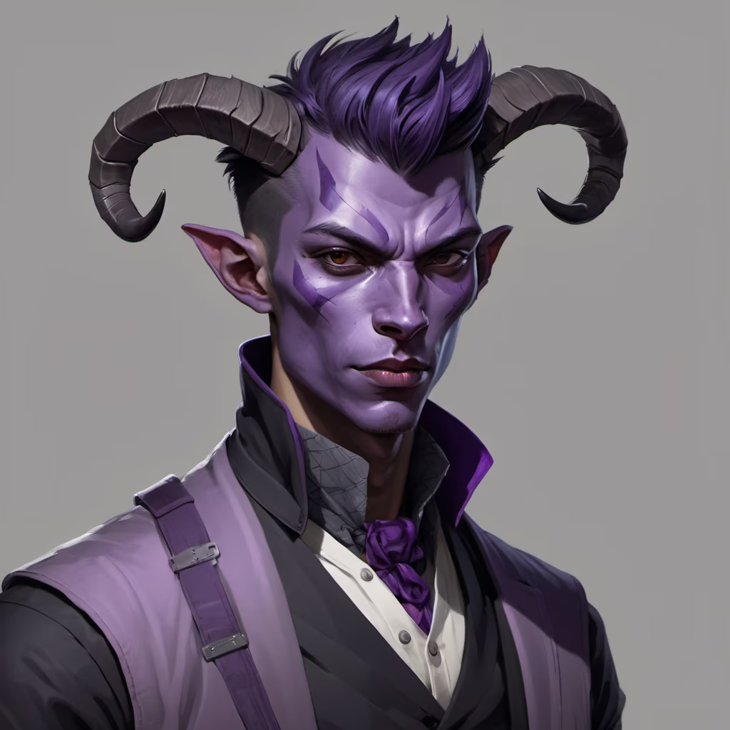
Prompt: Dnd style, young guy, purple skin, very small horns. Calm look. Regular clothes. Portrait against a gray background
Negative: elf
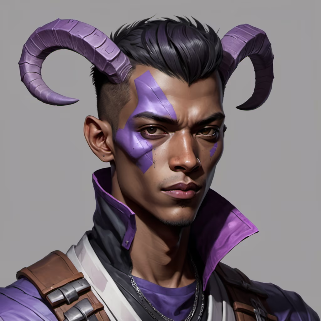


Prompt: dnd style, indiana Jones as a fantasy wizard in black leather jacket, holding a staff of fire, long black hair, short beard
Style: Low Poly


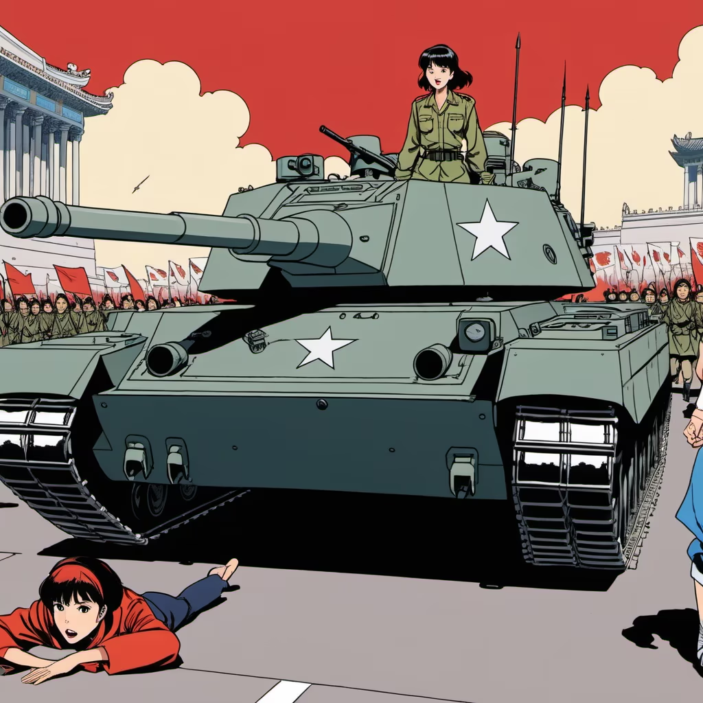
Prompt: 1980s Anime still, style of 1980s anime. wide angle, day time, hot anime girls being ran over by tanks and mutilated while protesting in Tiananmen Square during the Tiananmen Square Massacre of 1989, Chinese, china, gore, violence, death, protest, fire, tanks, mutilation, murder, propaganda, blood
Style: Comic Book

Prompt: A Chinese logo, mainly in Hong Kong style. The name of the logo is:阿爺蘇記燉蛋 . It needs auxiliary symbols and graphics.


